Monthly Archives: November 2013

XXX-Treme!

By | elves, Fan Art, hairy, Marvel, muscles, X-Men | 2 Comments

Even though teen me barely kept up with metal, I was certain that it was influencing 90’s comic character designs. Shatterstar, Rictor, Warpath, Omega Red, AoA Magneto and even sometimes Gambit all had giant manes and outta control ponytails. Of all those guys though, Adam X the X-Treme looked the most like he belonged in a hair metal band.

What annoyed teen me about this character though, besides the look, was the strong push he got. Nicieza really wanted Adam X the X-Treme to become the next big thing and sadly, it seemed like the only person who cared about Adam X the X-Treme was Nicieza.

Even the letterers were directed to make the character seem more important than he was. Remember how every time he was mentioned, the whole name, “ADAM X the X-TREME” was always written out– in big bold red title fonts? Like, just in case all the hair and all the ridiculous blades wasn’t enough, lets remind these kids to notice Adam X the X-Treme by shouting it every time.
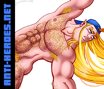
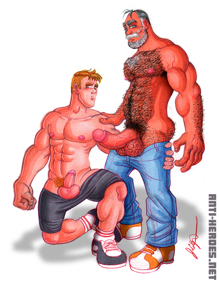
Sooo, fast forward to my life in hipsterburg 20 years later where long haired blondes (especially with beards) are my number one dick hardener. Thusly, Adam X the X-Treme happily joins my RemiX lineup mainly just as an excuse to draw a hung hairy hippy hottie. Check it out in my Members Gallery I went a little nuts with his XXX version– that wang I drew definitely borders on the hyper/macro genre.

Another Blast From the Past

By | cutesy, Fan Art, King of Fighters, Marvel, muscles, old works, SNK, video games, X-Men | 2 Comments

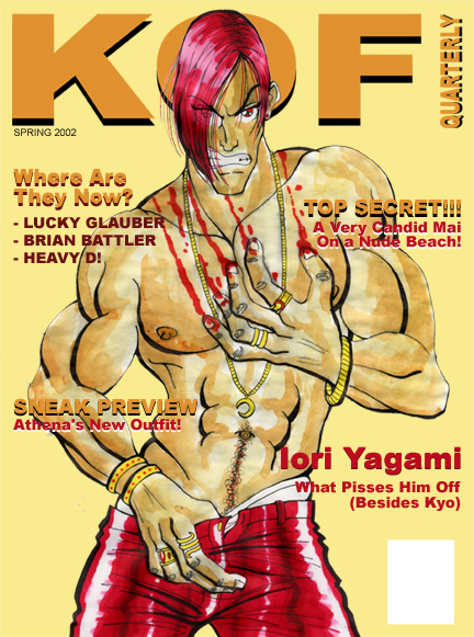
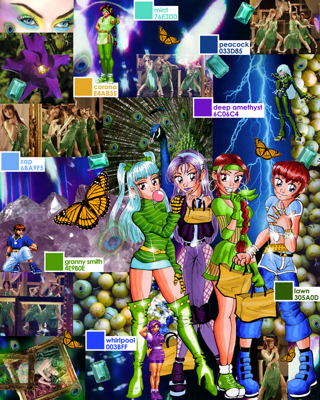
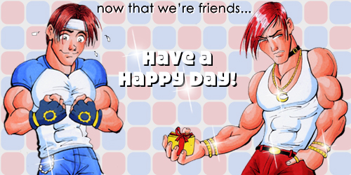
Thought I’d put this old stuff out there– I’ve lately been interested in my progression as an artist, so it’s interesting to go back and review past work. All of this stuff is circa 2001, where marker was my primary medium and I was only getting started with digital coloring.

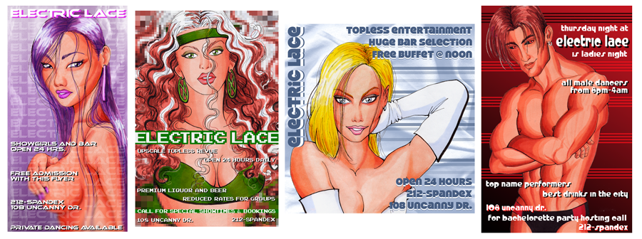
This Electric Lace series was trying to incorporate graphic design with illustration as a point of interest. They look horrible to me now– and do nothing to show my design skill, but at the time I thought this was a good idea. Notice how the subject matter is pretty risque, particularly taking into account that these were supposed to be examples of non-erotic work. This is what I mean when I always say that erotica was always subtly coming out in my old work. Granted, in marker techniques class, the usual assignment was to render a hot sexy girl from Maxim or something. So I guess my subconscious erotica-lean has a bit less to do with this than I may want to claim.

KOF Quarterly is also trying to show some sort of type design skill but I can hardly look at this piece now. Besides the dreadful early attempt at watercolor, there are so many type design errors, I can’t believe I ever had this on any site– lol. I may redo this piece for the “Draw This Again” meme because I love Iori and don’t feel as though I’ve represented him properly in my art.

Next up is a color story mood board. Making stuff like this was one of my first jobs out of school. I took a drawing I did for a KOF fan art contest and collaged it with harmonious colors– another attempt at incorporating illustration and design. I must say though that this was the beginning of me recognizing that I have a pretty good color sense.

Finally, we have another piece form the KOF fan art contest. I think the rules were to make the art into an e-card or something. LOL that I’m still using that same flare today.