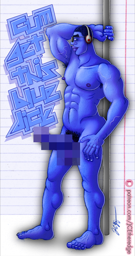
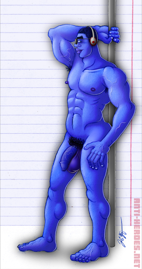
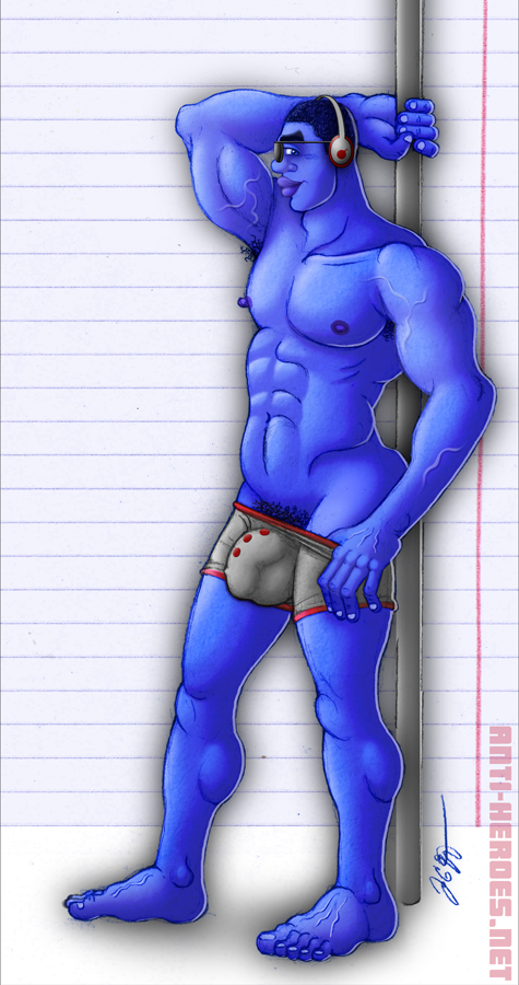
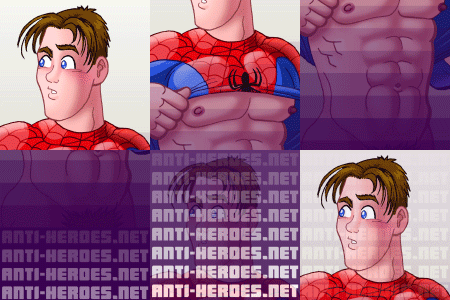
Full version on Patreon just $1: ow.ly/3vCh50I51W9
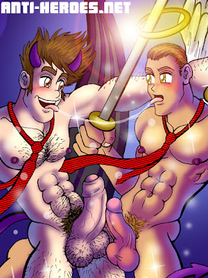
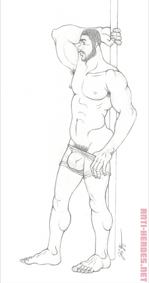
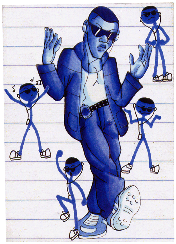
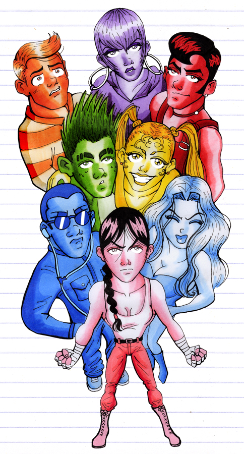
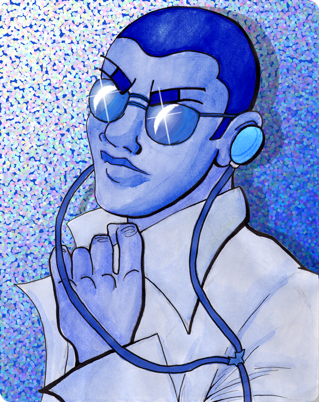
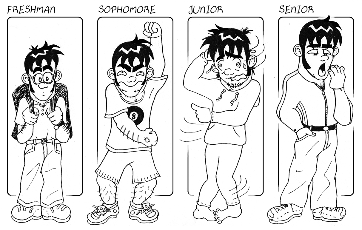
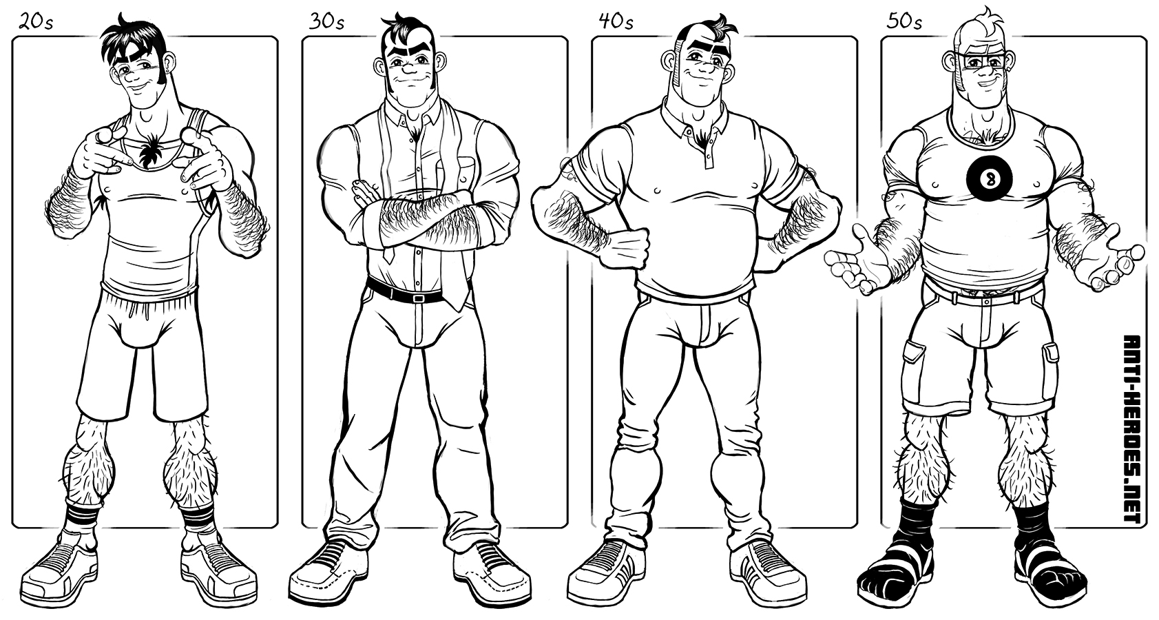
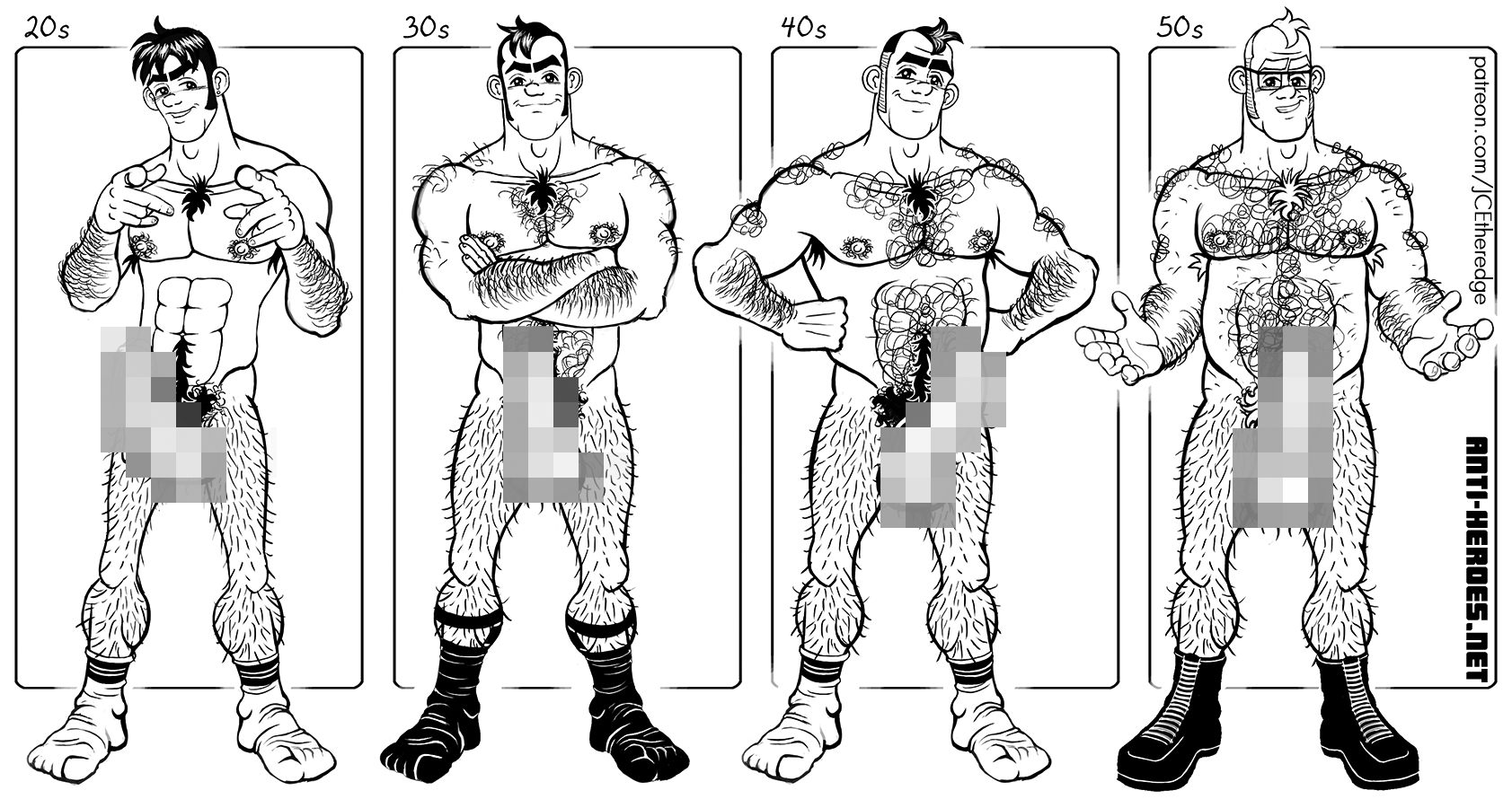
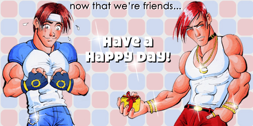
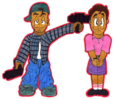
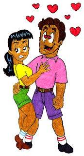
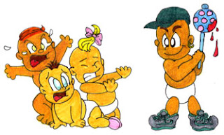
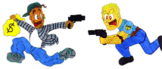
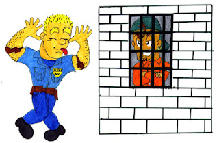
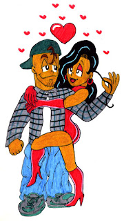
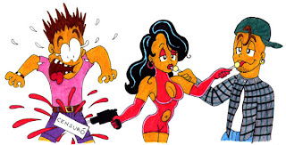
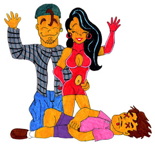
Revisiting an episode of my high school school newspaper comic strip Backpage Backtalk, published in January 1998! Drawing Nico again 22 years later was fast & fun due to muscle memory of my 18 year old somewhere between Tiny Toons & Ranma style.β¬
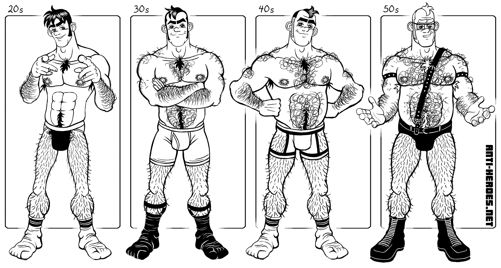
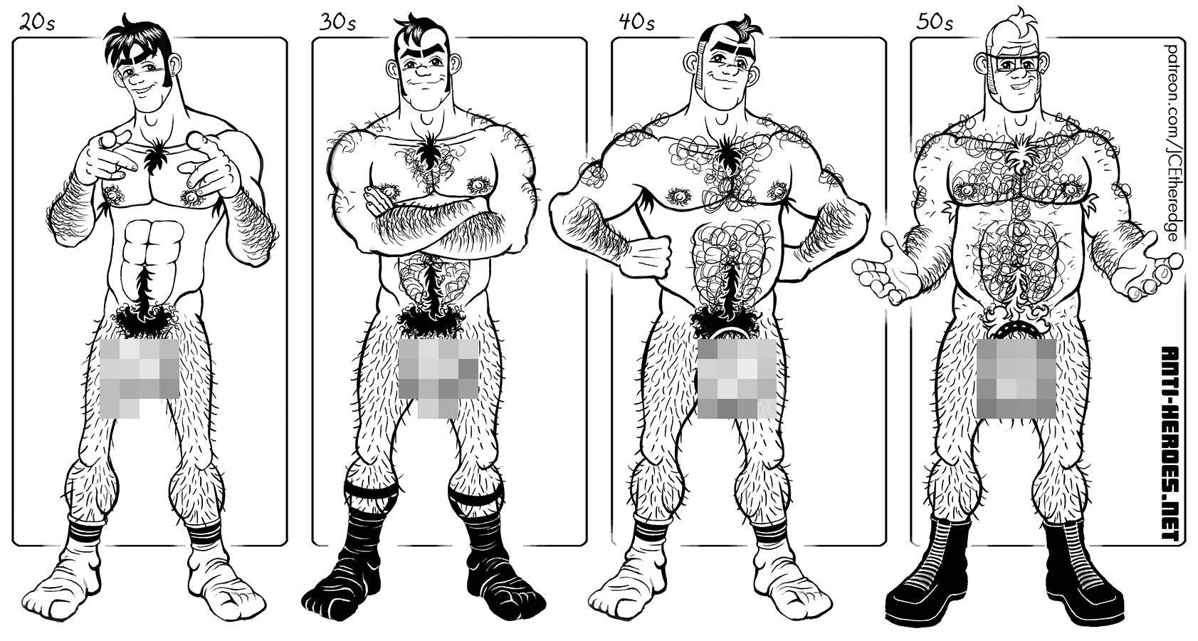
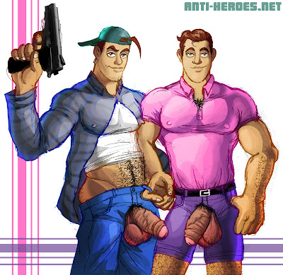
βͺX-Rated versions (on Patreon) all still try to make a few little jokes while still being crazy hot to me. I hope you enjoy finding all the little aspects that do and donβt change. So at which stage is he the hottest?β¬
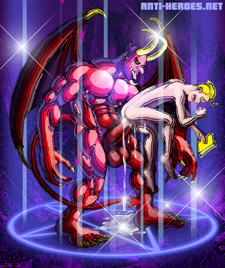
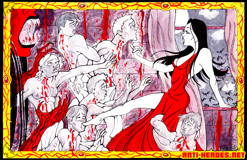
Guess who recently discovered his old college art! Yup, this piece is totally from the 90’s! I was 19 and thought I was so good! lol. Please no comments on the wonkiness of the piece- it was about 20 years ago. The assignment was to create a horror illustration using only 2 gouache colors and black and white. In my teens, before I was out and showing my gay erotica, I was really into depicting violence to add a sense of masculinity and detract from the work’s ambient gayness. But the inherent eroticism in my art always showed through, prompting several of my art school teachers to steer me in the direction of porn.
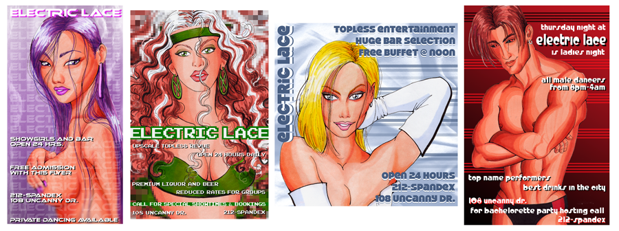
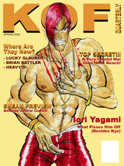
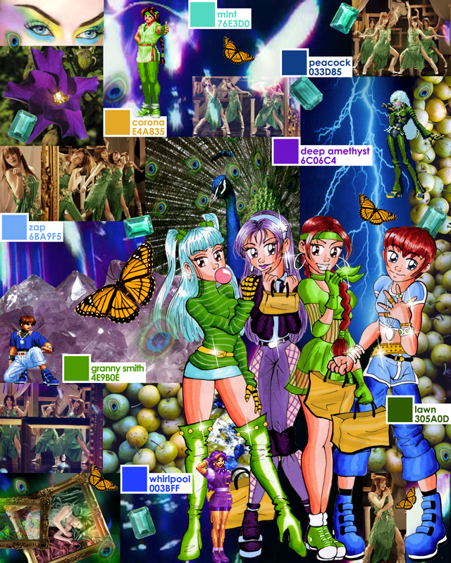
Thought I’d put this old stuff out there– I’ve lately been interested in my progression as an artist, so it’s interesting to go back and review past work. All of this stuff is circa 2001, where marker was my primary medium and I was only getting started with digital coloring.
This Electric Lace series was trying to incorporate graphic design with illustration as a point of interest. They look horrible to me now– and do nothing to show my design skill, but at the time I thought this was a good idea. Notice how the subject matter is pretty risque, particularly taking into account that these were supposed to be examples of non-erotic work. This is what I mean when I always say that erotica was always subtly coming out in my old work. Granted, in marker techniques class, the usual assignment was to render a hot sexy girl from Maxim or something. So I guess my subconscious erotica-lean has a bit less to do with this than I may want to claim.
KOF Quarterly is also trying to show some sort of type design skill but I can hardly look at this piece now. Besides the dreadful early attempt at watercolor, there are so many type design errors, I can’t believe I ever had this on any site– lol. I may redo this piece for the “Draw This Again” meme because I love Iori and don’t feel as though I’ve represented him properly in my art.
Next up is a color story mood board. Making stuff like this was one of my first jobs out of school. I took a drawing I did for a KOF fan art contest and collaged it with harmonious colors– another attempt at incorporating illustration and design. I must say though that this was the beginning of me recognizing that I have a pretty good color sense.
Finally, we have another piece form the KOF fan art contest. I think the rules were to make the art into an e-card or something. LOL that I’m still using that same flare today.
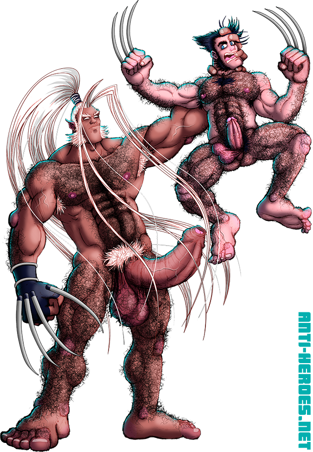
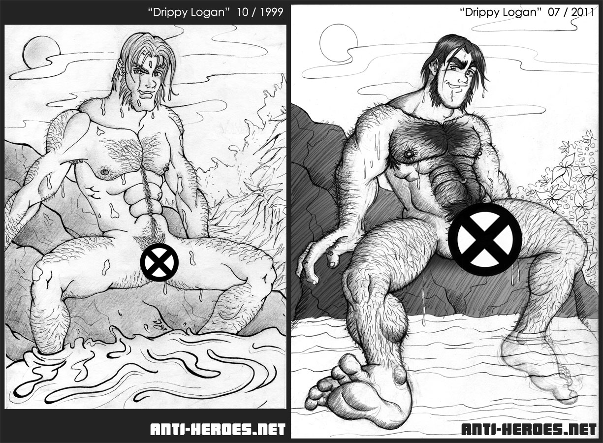
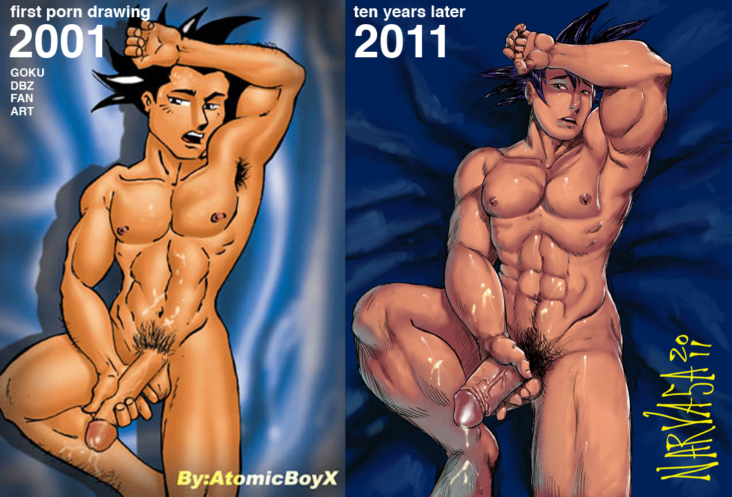
Inspired by this piece in AtomicBoyX’s gallery, I wanted to see if I could do something similar with one of my old pieces of fan art.
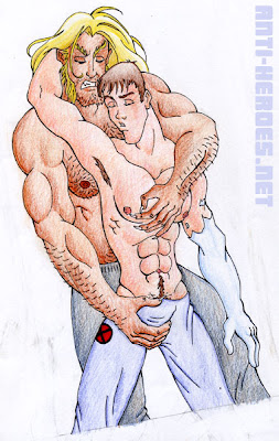
This image of Logan on the left is the first piece of fan art I ever put online. It’s so old– I was a sophomore in art school at the time, only 19. I remember keeping it hidden for a while– cuz yunno, it’s porn– but showing friends eventually and everyone liked it. I mean… really liked it— evidently my roommate in particular– as I came back to my dorm room from class one day to find the drawing on his bed. 0___o
The positive response led me to start the erotic art section of my website. And from then on, it became more and more obvious that I tended to care much more about my erotic work than any other.
And now today, I give you the remake of this piece! Glad to see I’ve improved in some areas. Although some things have definitely remained the same.
Full fat-drippy-1st-uncut-dick-ever versions are of course at Anti-Heroes.net β Members Gallery. And I’m interested if you guys also get inspired to redo one of your very early fan arts. Let me know if you do– let’s start a meme!
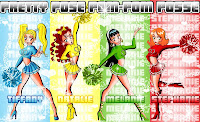
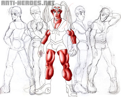
The Posse began as a fleeting idea I had in college. It’s basically a send-up of one of my favorite Japanese anime series, Sailor Moon. A friend of mine got extremely upset that I’d draw cheerleaders in high heels. She didn’t get that was one of the jokes.
(Right: Pom Pom Posse Beginning; circa 1999)
The core group began as just four girls. Tiffany was the ditz, Natalie was the leader, Melanie was the brain, and Stephanie was the ho.
(Right: Pom Pom Posse Portraits; circa 2000)
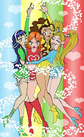
I think it was my junior or senior year when I got a portfolio review by a guy at TokyoPop. He liked my work and encouraged me to submit something starring the girls. From then on, the Posse has been a work in progress in my head.
(Right: Posse Group Hug; circa 2000)
The first thing I did next was design Brittany. I had always felt a little hypocritical not including a brown character in the mix, being someone that is a huge proponent of diversity.
(Right: 1st Brittany; circa 2002)
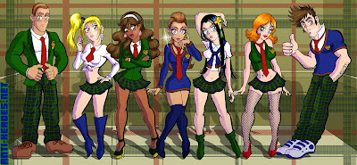
Then, since I desperately craved a few male characters in this thing, I created Jeremy and Zachary. But then I quickly tired of the idea of male cheerleaders and removed them from the squad (but not from the storyline.) Jeremy, the brunette, is a hot shot heartthrob on whom all the girls have crushes. Zachary, the blonde, is Jeremy’s best buddy but more uptight than anyone else.
(Right: Jeremy & Zachary; circa 2002)
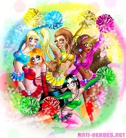
The girls underwent many revisions in my sketchbook, but this design for them is the most recent. Natalie gets a new hairdo and becomes a lot more of a snarky bitch while Brittany loses the dreadlocks but remains a no-nonsense tough broad.
(Right: The New Pom Pom Posse; circa 2008)
Upon seeing the movie D.E.B.S., (which is a-fucking-mazing… in a campy “aww this actually got funded” kinda way) my fetish for prep school uniforms was restored. So below are the versions of the girls and boys when not in Pom Pom mode.
I won’t go into too much of the plot here, but I will tell you that one of the reveals is that Zachary and Jeremy not only have their own special transformations but also, of course, have the hots for each other! The drawing below was more for me than the actual story, being that the plot is kinda all-ages as I see it.
But this is precisely why this series never went anywhere. I just don’t have the drive to finish it cuz it’s not porn! π Someday…
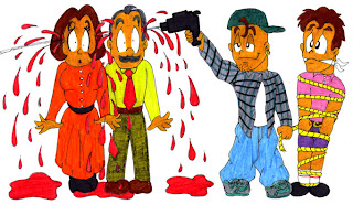
Pedro y Pablo was for sophomore Spanish class, I think, and I’m pretty sure the official assignment was some kind of research project. I instead chose to write and illustrate a violent children’s book. No fair laughing at my crazy hands and feet, okay? Whaddaya want, I was 14!
Pedro era listo, exitoso y tenia una hermosa novia llamada Raquel. Pablo era malvado. (Pedro was smart, successful, and had a beautiful girlfriend named Raquel. Pablo was evil.)
Los padres de ambos sabian que habia algo mal con Pablo cuando mato a los othros bebes en el hospital donde habia nacido. (The boys’ parents knew something was wrong with Pablo when he killed the other babies in the hospital where he was born.)Por lo que se deshicieron de el. (So they sent him away.)Pablo se convirtio en un ciminal y asi un dia acabo en la carcel. (Pablo grew up to be a criminal and was eventually locked up.)Los siquiatras de la prision, sin embargo, diagnosticaron que la maldad de Pablo ero producto de genes defectuosos y una mala crianza. (However, prison psychiatrists said that Pablo was evil because of bad genes and faulty parenting.)Cuando salio de la carcel Pablo se vengo de sus padres pegandoles un tiro en la cabeza. Luego ato a su hermano y lo escondio en el baul del carro. (When released, Pablo took revenge on his parents by shooting them in the heads. He then tied his brother up and hid him in the trunk of his car.)
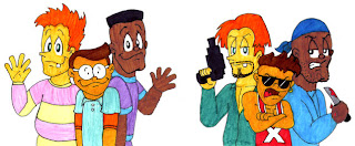
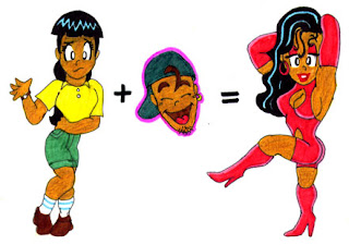
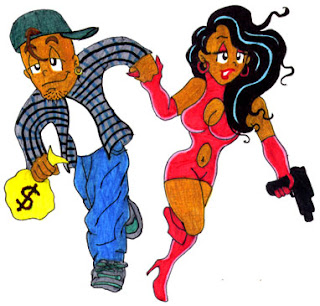
Pablo se posesiono de la vida de Pedro. Convirtio a sus amigos estudiosos en gangsters y a Raquel en una prostituta. (Pablo took over Pedro’s life, turning his nerd friends into gangstas and Raquel into a ho.)Pero con su nuevo novio, Raquel se sintio llena de vida. Juntos se embarcaron en una ola de crimenes. (Raquel finally felt alive with her new man. Together they went on a crime spree.)
Cuando por fin lorgo escaparse, Pedro intento retomar el control de su vida pero Raquel le metio un tiro en la ingle. (When Pedro finally escaped and proceeded to take his life back, Raquel shot him in the groin.) La moraleja es que no vale la pena ser bueno en la vida. (The moral of this story is that it does not pay to be nice.)
Yeah, I am pretty embarrassed about the ridiculous violence in this. What can I say? The late 80’s and early 90’s were all about blood and giant automatic weapons. That was “in.” Also, back then, being in the closet, I felt that I definitely needed a “hook” or “trademark” for my work to detract for any ambient gayness it might exude. The shock value of gratuitous violence was my hook.
Now it’s fat penises.
Looking back, I shouldn’t have been so post-crazy during the month of January. I doubled my normal post rate that month instead of saving things for a time like now when I have absolutely nothing to post. But ah well, it was all stuff I wanted to share immediately and anyone who knows me knows that patience is not my strong suit. bleh.
Cue this latest barrage of ancient drawings! This is all stuff you guys have never seen– all stuff from my drawers and folders and sketchbooks from the past. I’ll show them in chronological order. This first one is circa 1999. I was in my 1st or 2nd year of college and was busy writing erotic stories about X-Men and posting them on the web. This was one of the ones I illustrated as well. All I remember about the story was that I wrote a really good closeted Iceman. HAHA.
So yeah, at first I was upset to see my two favorites at the bottom of the barrel. But then I thought, “Hey, since I’ll have to do my faves last, I’ll no doubt unconsciously make them BETTER than all the previous ones!” MUA HA HA!
Yes, Bishop and Iceman have always been my favorite male X-Men. I remember the day I first learned of Bishop. Picture an 11 year old me and a friend in the schoolyard one morning:
Nick: Dude, did you see the new issue of X-Men!? There’s this new Black guy and he’s BIGGER THAN COLOSSUS!!
JC: What’s his powers?
Nick: I dunno– some energy shit. BUT HE’S HUGE!
We skipped lunch and booked it to the local comic shop where I grabbed a copy of Uncanny #282. Bishop remained me and Nick’s favorite for a while– mullet and all. Although Nick eventually abandoned Bishop once he realized Bishop actually wasn’t bigger than Colossus. (size queen)
So yeah, if Bishop was the X-Man I wanted to be, then Iceman was definitely the X-Man I wanted to fuck. He was so fun and boyish, but maintained that jockish charm that really spoke to my teenage gay libido. I was sooo convinced Marvel was going to make him queer. Everything about his storyline in the 90’s led to it. But alas, they gave us Northstar instead. No offense to Northstar lovers out there but I can’t think of anyone who liked that guy before they made him gay.
Oh- and to prove my insane gay fandom for Bishop and Iceman, here is an extremely old, unfinished fanart of them. This is like circa 1997– don’t laugh at my deformed lookin’ hands!
Also adding my Cannonball into this mix. He was an afterthought for me which was why I never included him in the poll. I only did him because I wanted the complete set to total 20 and not 19. (I don’t like odd numbers– primes even less.) Don’t get me wrong, I love Sam– moreso than any of the others I almost made instead of him (Havok, Cable, Forge)– it’s just that I liked him better on X-Force than X-Men.
I thought it was appropriate to hurry up and post this before this new cartoon “Wolverine and the X-Men” comes out. I’ll take X-Men in any media I can find, but this cartoon looks like its gonna be the worst of all. First off, I’m not feeling this overly svelte design for Wolverine. And I’d rather a more popular character get the spot that it seems they’ve given to Forge. Also, why is Emma confirmed so soon and not Storm or Jean? If those two aren’t included, then its not X-Men. I mean, X-Men is supposed to be about accepting diversity– giving blond-haired blue-eyed Emma a spot over Storm is a travesty. Opinions?
Oh– and one final thing. I have a sekushi wallpaper of all of my male X-Sluts up in my new wallpapers section of my site! Take a peek.
In the meantime, because you guys liked that concept, I thought I’d show you where it originally came from. As I said, I have been intrigued by Greek mythology for the better part of my life. I used to sketch modern versions of the deities quite regularly. So, I’m once again opening up the vault of old shyt to show you these scary sketches of the gods. I was probably 17 or 18 when I drew these and I remember it was an attempt at fashion illustration. Pretty embarrassing– I know. Well, I am still somewhat proud of my Hera and Apollo. But yeah, the rest of them look pretty deformed.
So I’ve picked my 10 favorite strips for you guys to read. Since some of them are really specific to my high school, I’ll clarify some of the jokes for ya.
On this next one, the “caf-card” was what we used to get food at the cafeteria. I coined that term, btw.
This next one was a bit of a hit, so I kinda repeated the same joke a few months later.
And with this next one– the story was, one day, the ceiling caved in due to the weight of some raccoons that had nested there. It was a temporary building, and I think the raccoon fiasco was what got the administration really on-the-ball about building the permanent space. Sadly, I graduated before it was finished. But raccoon day will go down in history as the highlight of my high school career. Those fuckers are huge!