


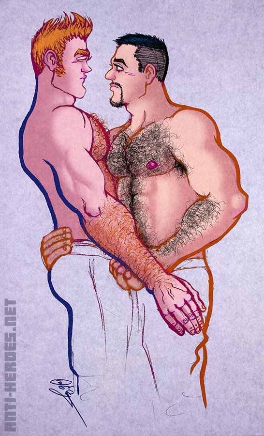
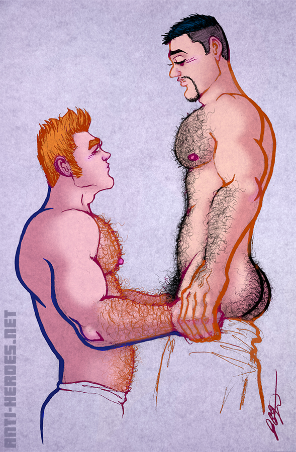
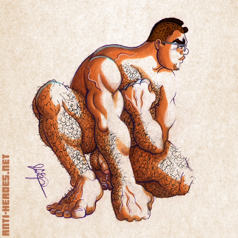
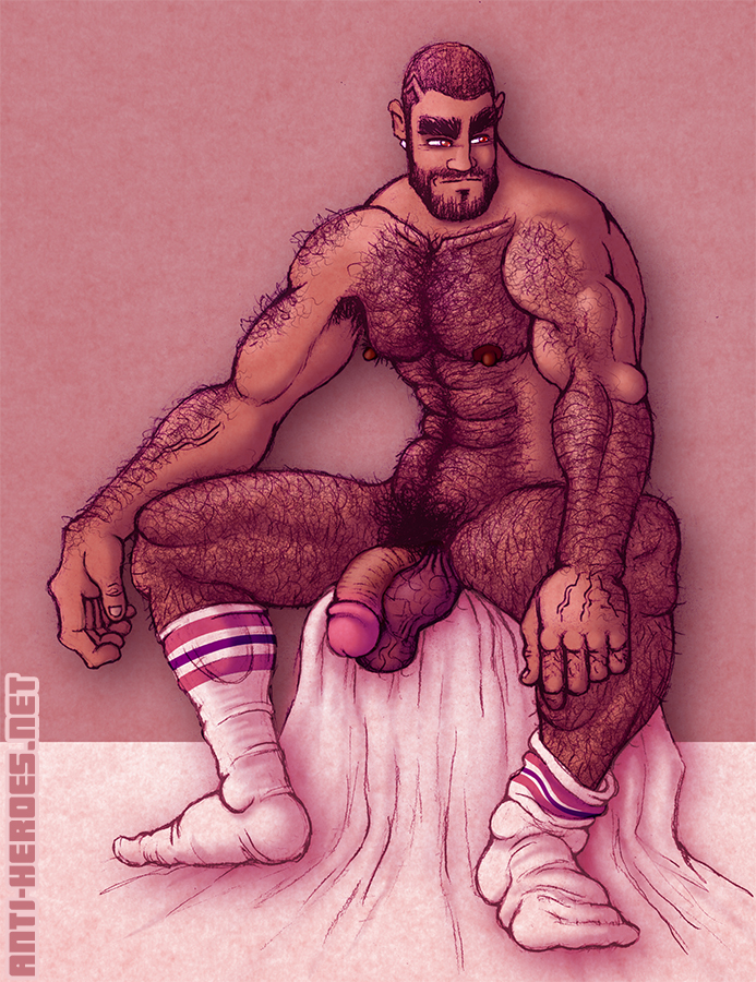
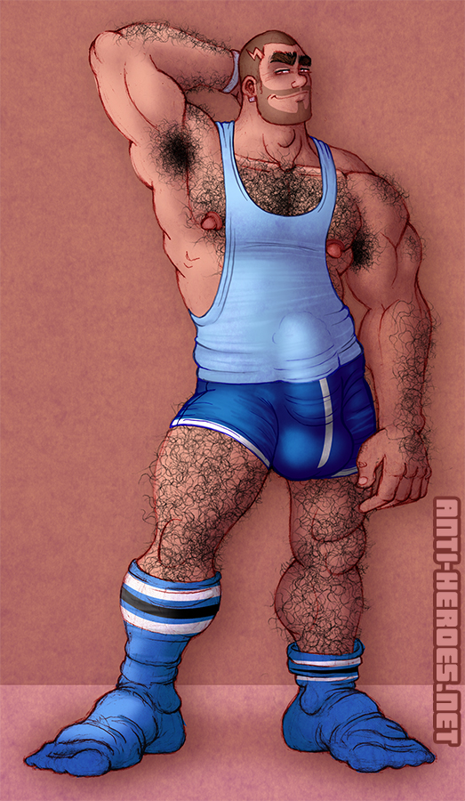
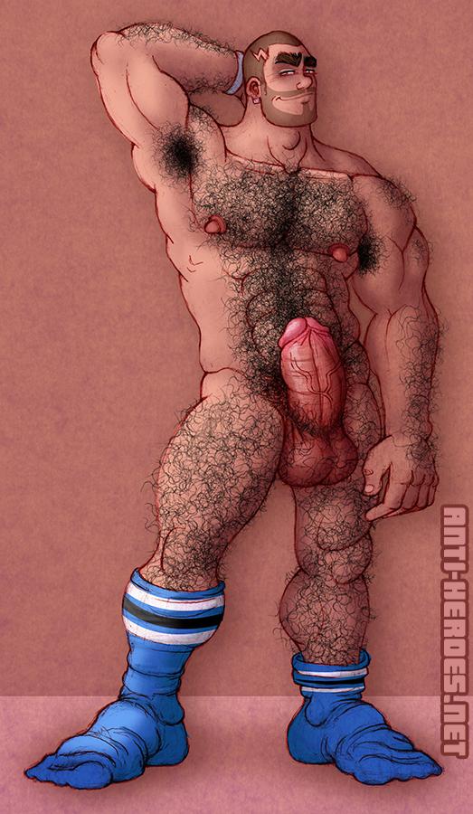
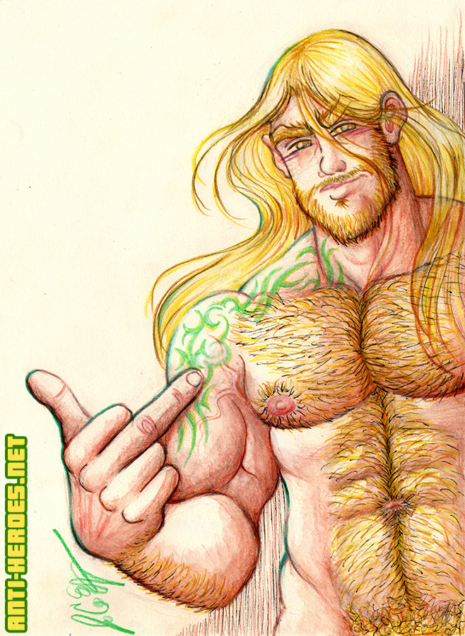
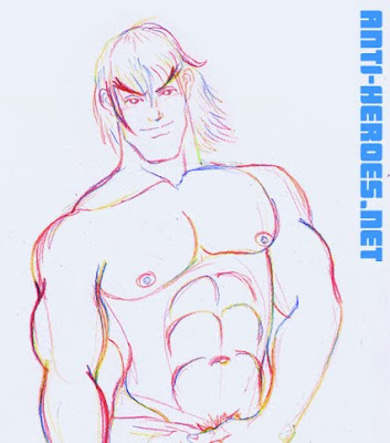
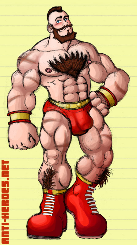
Had this old sketch of a random doofy dude looking at his crotch with a surprised expression but recently built it up into toons more relevant to me at the moment. Zangief was first to come to mind because he’s hot AF in Street Fighter 6. Then Haggar, because he’ll always be Geef’s alt & rival even if they’re never in a game together. Then my own character Ryan because I’ve missed drawing his body hair. Duck versions on Patreon here = https://www.patreon.com/posts/oh-yea-im-hung-122797662
Category Archives: Street Fighter
Unexpectedly started a day job in May that not only threw a wrench in my art production but also left me profoundly emotionally discombobulated. Juggling that with three major exhibitions back to back this summer and fall led to little to no web posts. 🙁 It’s all thankfully over now so I can get back to drawing and getting out the tons of sexy WIPs I’m working on! In the meantime, enjoy these nasty new life drawings! Much more cumming, so watch this space!
The sesh where two of my favorite models met up and put on a spectacular show. Was too distracted to get much else down on paper.
Remember this session well– this kid WENT TO TOWN on his butthole! He really got into it.
This model’s body type really reminded me of Fei Long. Yunno, ripped but not huge.
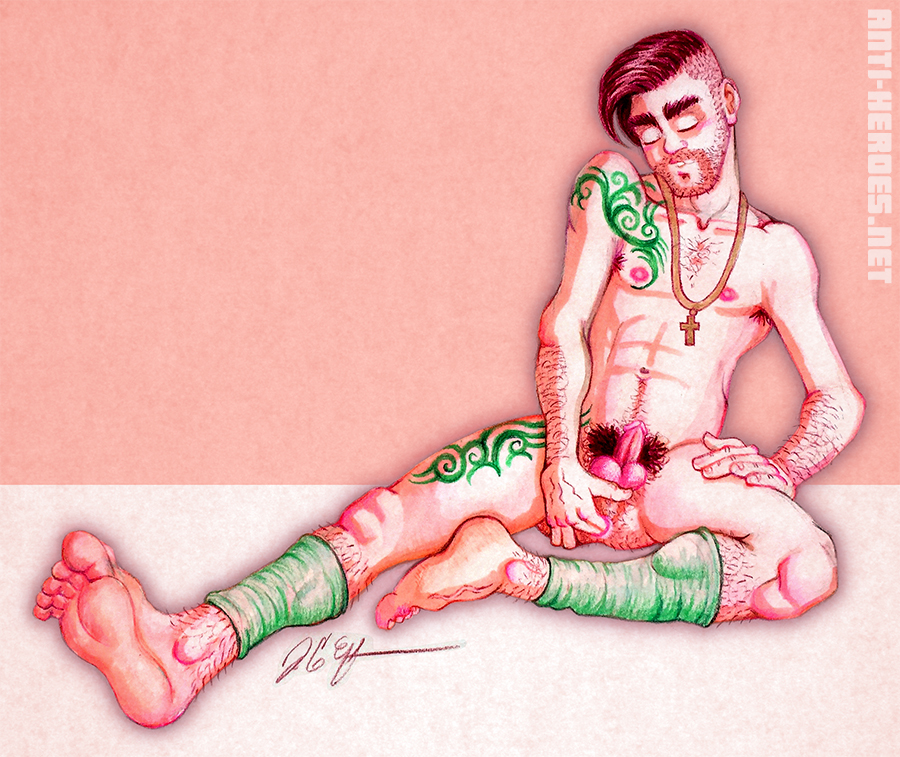
Here’s a new chara I’ve been drawing but don’t quite know if I’ll use him much now but maybe eventually! I love his MegaMan mohawk and chode!
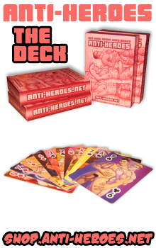
This is my sexy Torso Series, a burgeoning collection of drawings using traditional media, for sale at my upcoming shows. For now, I’m doing 2 sizes: Sketch Card size (2.5×3.5) and 8×10. Media is watercolor pencil, colored pencil, ink, and marker. Like/Reblog this on TUMBLR.
So I keep forgetting to post this but I’ve had these guys collecting dust in my cabinets of swag for months now. Back in March, I participated in the Black Party Expo and made a bunch of new BulgyBuds for the event; Leather versions of my OC’s and more renditions of popular characters that queers love.
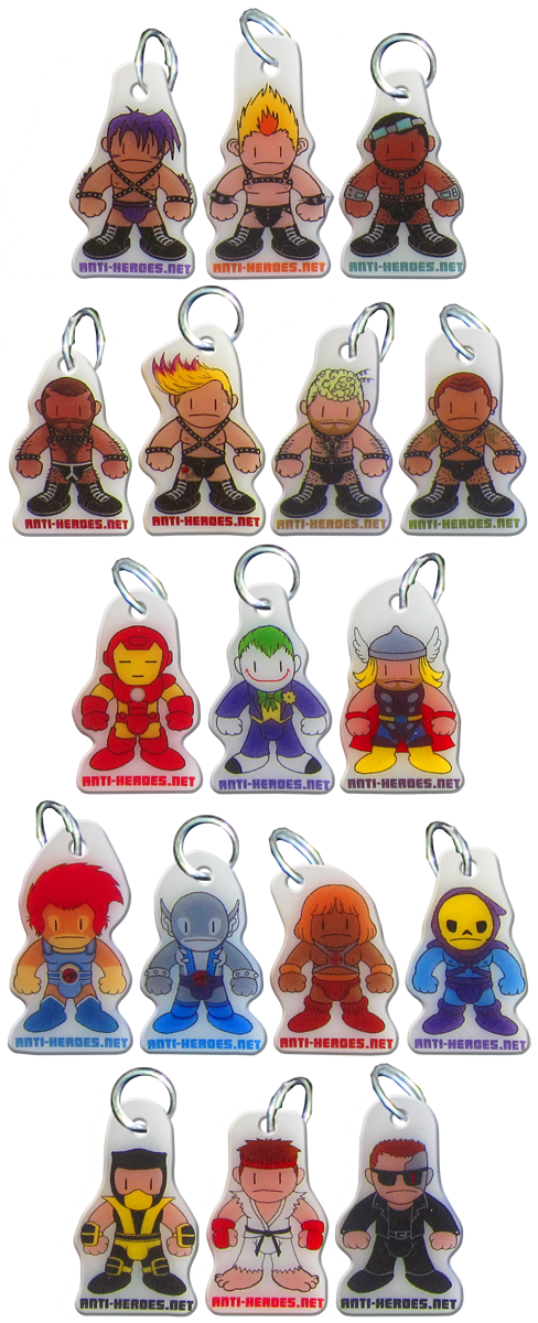
Full list including the original buddies is HERE.
Order at Shop.Anti-Heroes.net .
I’m at one of those awkward moments in my work where everything I’m presently working on is close to being finished but not quite there yet. They’re also all really big projects, so it gets kind of daunting to jump right in and pick them up; which is what I should be doing today. Instead I think I might play Fatal Fury or watch Inspector Gadget on Roku. We’ll see…
In the meantime, here is a sneak peek at all the giant projects I’m working on:
Persuasions: Phase 2 (continuation of your favorite gay toon porn web soap)
Ryu Gets Porked (interactive illustration)
Fap Fantasy (new site section + companion zine of illustration and prose)
Anti-Heroes: Boot Camp (online video game)

 This is kind of a big deal for me… revealing my payloads before they’re completed. I usually like surprising you guys. So yeah, appreciate this– LOL! Which project are you dudes most looking forward to?
So this week in erotic figure drawing, the model was Reggie, a hard-bodied hunk a actually knew from like 7 years ago. (We were both reluctant Gap employees in the west village!) But given this week’s props and my mood at the time, nothing was going to stop me from turning this set into STREET FIGHTER FAN ART! Bwa ha ha!
 Floppy Elephant Cock version =
Anti-Heroes.net > Members Gallery > Figure Drawing
 Naughty Ballsy Fondle Version =
Anti-Heroes.net > Members Gallery > Figure Drawing
 Massive Erection Strokey Version =
Anti-Heroes.net > Members Gallery > Figure Drawing
Nash (Charlie)

Yeah, I use the Japanese names. Sue me. I’m not trying to be a snob or anything, it’s just that the Japanese versions of the games are what I had growing up. There was a period there where you couldn’t buy U.S. released arcade-perfect versions of Capcom games! You HAD to import the Japanese version if you were an animation nazi and needed every single little frame (me.)
Guile

Ryu

Rolento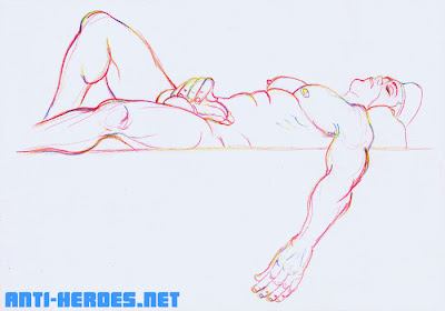

Adon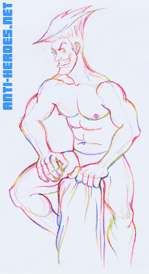

Although I was pretty unimpressed with the latest incarnation of Street Fighter, I will never deny the strength of these character designs. For me, they are some of the most iconic characters of all time.
M.Bison (Balrog)
 Floppy Elephant Cock version =
Anti-Heroes.net > Members Gallery > Figure Drawing
Ken
 Naughty Ballsy Fondle Version =
Anti-Heroes.net > Members Gallery > Figure Drawing
Birdie
 Massive Erection Strokey Version =
Anti-Heroes.net > Members Gallery > Figure Drawing
Street Fighter IV came out a few weeks ago, and like any die hard Street Fighter fan, I had the deluxe edition on pre-order and have been devoting as much time as I can to intense study of the game.

The Good:
It’s a new Street Fighter!
The Bad:
The roster is too small and the characters’ move lists have been greatly reduced. Both of these were conscious decisions by Capcom to make this game more like Street Fighter 2. They are trying to recapture the Street Fighter 2 fanbase and ignoring fans of the Street Fighter Alpha or Street Fighter 3 series’.
 The Ugly:
As a big fan of 2D art forms, I always had my qualms about the main Street Fighter canon going 3D. Indeed, a valiant effort was made to preserve the art style of the older Street Fighter games… but it wasn’t enough for me. The 3D character models are clunky and awkward. Admittedly, some of the 3D models are much better than others. Ryu and Ken (of course) look amazing. But there’s something kinda… doofy about everyone else. Whether its the animation or the model itself, none of them have the grace and elegance of the 2D Street Fighter sprites.
 For me, there is a huge disconnect between the beautiful calligraphy inspired promotional art, the clumsy in-game 3D models, and the traditionally animated “Pokemon-esque” story elements in the game.
Obviously an effort was made to link the calligraphic promo art style to the 3D models because here and there the 3D models get what looks akin to a black brushstroke ink outline. But the brushstroke effect is too little and happens too rarely in the game to match the beautiful promo art.
 And then there are these weird cartoon cut scenes that look as far away from the promo art and 3D models as you can possibly get. The animation is limited and character design is over-simplified and completely off-model. It literally looks like Pokemon to me. These little mini-toons are supposed to tie-in to the Street Fighter 4 animated movie, done in the same style. Personally, I think they should’ve kept these cut scenes out of the game. It gets too mis-matched.
In previous Street Fighter games, the promo art, gameplay art, and story art all looked like they were done by the same hand. That brought a sense of cohesiveness and gave those games a tight, complete feel.
 In conclusion, yah I’m playing it like crazy because it’s a new Street Fighter. But I’m constantly wishing I had more characters and more moves. It pains me to look at a lot of it. I skip the story scenes. Whenever I have to fight Dhalsim, I try to beat him as quickly as possible because I hate that 3D model. What’s wrong with him? Is the head too big or something? He looks like a baby. None of the new characters impress me that much. El Fuerte is welcome, I guess, but kinda… expected. C.Viper I find boring. I mean, come on, ANOTHER female agent character? Rufus is stupid and a little offensive. Everytime I have to fight him, I get sad that so much effort was put into him while E.Honda, the original fat guy of the series has been totally ignored.
 Abel is cute… sometimes, but again, somewhat yawn inspiring. His outfit is lame, he’s got redundant moves, and his personality puts me to sleep. It’s a good thing he has that alternate singlet outfit or else he would have never made it to my sketchpad! hehe! Enjoy this drawing and the raunchy NUDE, ERECT rollover version. (Oh, and sorry Doug. He’s French and French people don’t circumcise.)
Almost 20 years ago, when I first played Street Fighter, (woa– I dunno what’s freakier– that SF is 20 years old or that I can say “20 years ago!”) Zangief was perhaps the last character I picked to play with. Don’t get me wrong– the bulge was magnificent- and he had a great ass. But I think I was freaked out by the scars. Remember in the old games, his scars were bright red– they looked like open sores. Grode.
Over the years, I’ve come to appreciate the awesomeness of the Geefster. So take a look at this quickie I whipped up. Roll over for the SHAVED version. Yeah, who knew he’d be so fucking hot beardless?! YUM! And for nude and erect versions of the Red Cyclone, visit the Fan-Boy section of the Anti-Heroes.net Members Gallery. Dosvidanya!