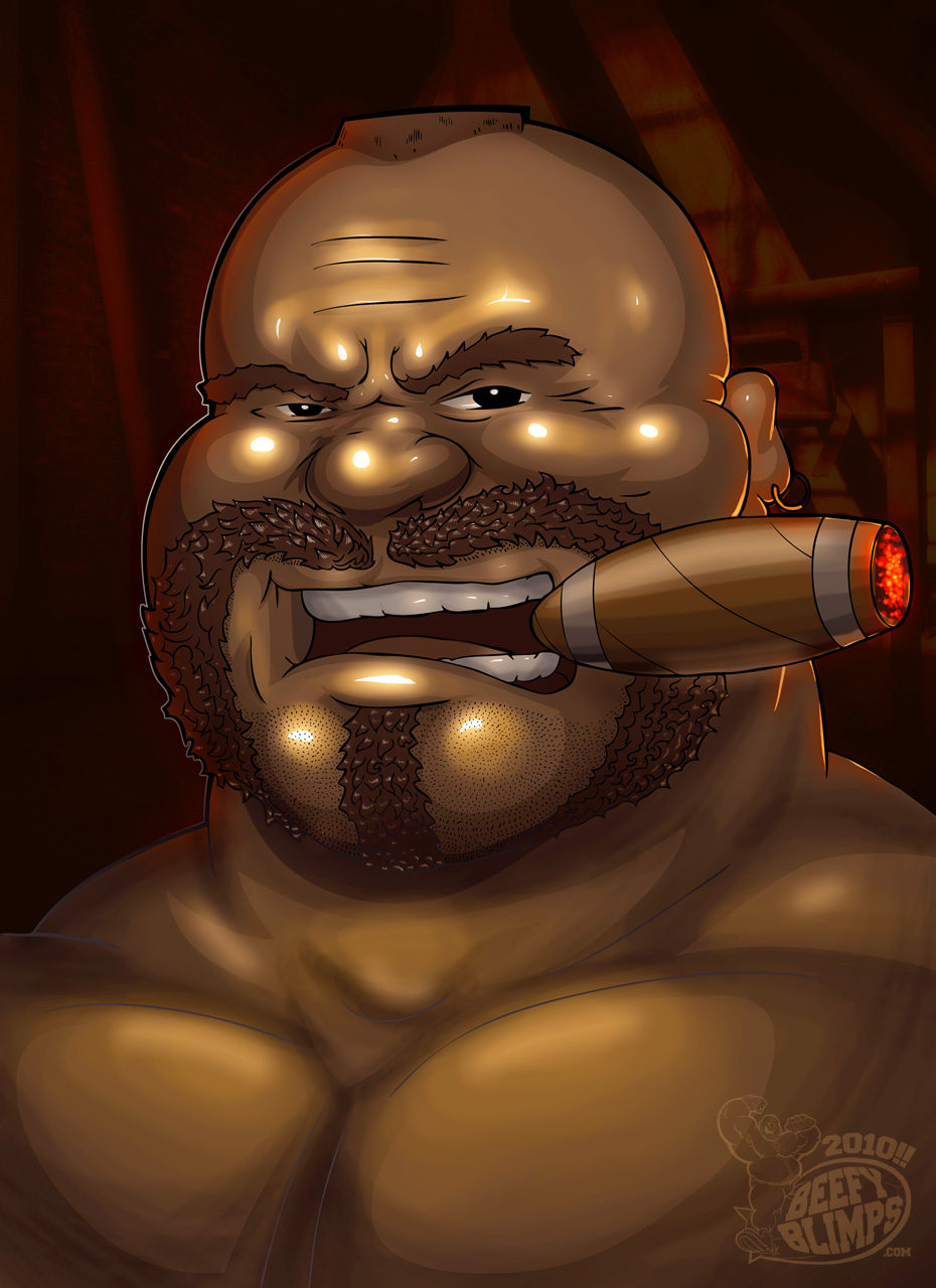
 Hey guys, check out this artist I recently met, BeefyBlimps.com. Awesome artwork and a really cool guy!
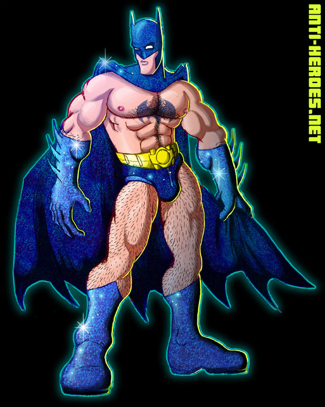
Category Archives: hairy
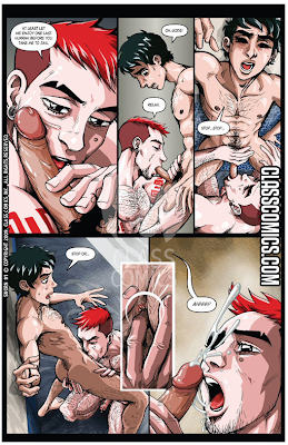
Hey gang! I wanted to blog real quick about some exciting new work coming out of Class Comics. All their books are of top-notch quality and feature some of the hottest writer / artist teams in erotic comics. But I wanted to mention 3 of the ones that I find especially titillating!
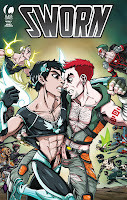
Sworn #1 isn’t quite new from Class but I don’t think I ever blogged about it. It’s a sexy superhero romp and love story between this adorable twink called Calais and Slammer, a furry redhead badboy. My colorist on Anti-Heroes #3, Silvano is the the artist and the pictures are nothing short of fabulous. His style is reminiscent of the gorgeous animated shows of the 80’s, with his crisp line and vibrant color choices. Throw a few furry cocks in to the mix, and you have a really enjoyable comic read / wank.

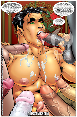
Next up is Felinoids #3. Patrick Fillion, founder of Class Comics is the writer / artist here and it seems he’s really outdone himself. The Felinoids are a race of cat people with extremely high sex drives. Yeah, all of Patrick’s characters are pretty sexual, but with the Felinoids, it’s an important character point and part of their fictional history. And with this book, you can tell Patrick is really pushing this fact as the orgies are bigger and more detailed than ever. Practically every page is bodies upon bodies upon more bodies. You will be scanning these panels for hours finding all the sexy details Patrick crams in.
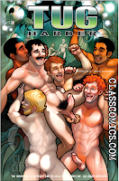
Finally, I’d like to mention Tug Harder #2. Butch McLogic is the writer/ artist on this series and I will admit here that am more jealous of his technical skills than ever! haha. He is absolutely amazing. I love that he celebrates various body types and men of different ages. And he renders each character as lovingly as the next. He’s just a real unique talent that every gay art fan needs to see. The series is about a sexy reporter who goes undercover at a redneck fuck-farm but then they all get abducted by aliens. It’s pretty imaginative and stupid hot.

There are a fuckload of other quality pr0n books published by Class, all of which are on my shelf and highly recommended. Check them out at ClassComics.com or at your local comic shop!

GENERAL PRIDE needs a backstory. I’m leaving that up to you dudes!
And don’t forget to ROLL OVER for the sexy battle damaged version! What happened to General Pride to make him so… ravaged?! You dudes can come up with that too. Lazy.
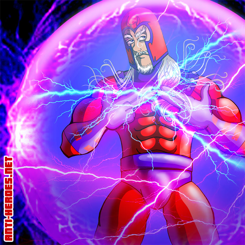
 Every time I look at my old fanart, the pieces I love the most are everything from my X-Men Remix collection. It combines my 2 main loves: X-Men and character design/redesign.

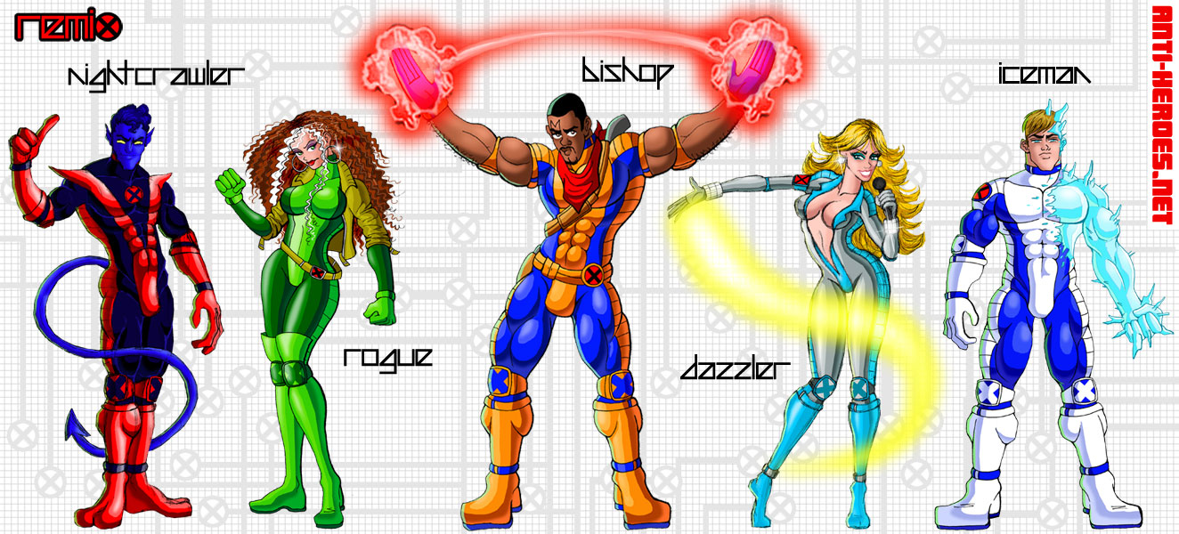
(Remember, Flash animated raunchy versions of each of the boys are @ Anti-Heroes.net > Members Gallery > Fanboy Gallery. What about the girls? Hey that’s sexist! How dare you think such a thing!)
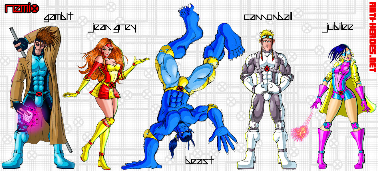
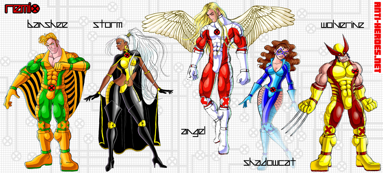
I’ve expanded it by adding some figure drawings and villian portraits. In fact, here’s a new one featuring everyone’s favorite Malcolm X metaphor, Magneto.
And for the naked low-hangers version,
So now I think it’s time to get down to the nitty gritty and add some more characters to the original set of drawings. I compiled another list of 20 second-tier X-kids to add (because apparently it’s impossible for me to undertake small, simple projects.)
First up is Madrox AKA Multiple Man. Given who I am and what I do, I’m sure you guys don’t need to stretch your imaginations too far to figure out why he was always one of my favorites. As with all my versions of the male X-dudes, there is a naked version out there for you guys to discover. To the left is a preview of said image; full version at Anti-Heroes.net > Members Gallery > Fanboy Gallery.
So who should be next? I mean, I’ve already made my list but maybe you guys can influence the order in which I post em…
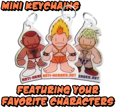
Behold my latest perversion. Well, not quite my latest per se. I’ve been drawing these since I was 8. But when I told my friend and fellow illustrator, Julain Lytle about them, he clued me in on something that hadn’t quite entered my head– that these guys were pretty marketable. Specifically he said that girls who go to comic cons would love them. Now, since I kinda “don’t do” comic cons, I thought, how could I translate these for the cons I DO participate in (gay erotica cons?) Thus, Bulgy Buds were born.
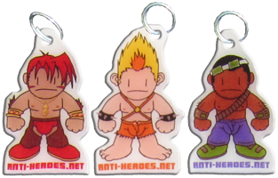
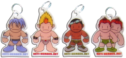
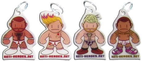
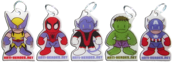
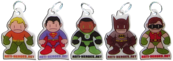
These guys are actually made from Shrinky Dinks if you can believe it! Kudos to you if you remember what Shrinky Dinks are. If you don’t suffice to say I had tons of fun making them.
And they seemed to be a big hit at the Black Party Expo, which I just participated in yesterday. I agonized over whether to do only my characters or versions of better known ones. I ended up doing both, and as it turned out, both sold equally!
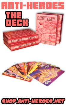
So yeah, if you like what you see, gwan and order some on Shop.Anti-Heroes.net. I’m doing packs of 3, 5 or 10 for you greedy collectors out there.
 Oh yeah, I took it there.
 And here we have another piece from my Daddy/Boy figure drawing session. Bonus points if you can figure out which famous duo this is.
Here’s another illo from that figure drawing session with the big guy and the little guy.

 And not that I can’t draw Sonic from memory (because I went through a phase in my adolescence where he was kinda ALL I drew) but when I quickly Google Imaged “Sonic,” this pic to the right was one of the FIRST images to come up. The drawing is phenomenal in its own right, but the audio bonus track very much makes this the best thing on the Internet… ever.
 In Erotic Figure Drawing this week, the 2 models were both guys I’d drawn previously. One is a cute little pocket-gay and the other is a tall hulking mastodon of hairy beef. I figured I’d better make this class because these guys together will make for some interesting drawings! Upon telling my friends the news, they all suggested I turn the drawings into famous “daddy/boy” “big guy/little guy” pairings. And so here you have… Cap and Bucky!
For this pose, both the little guy and big guy sat on chairs covered in cloth. Little guy tweaked big guy’s nipple while big guy (who was super oral) tongued little guy’s neck and face. At first, I was bummed that from my angle, I couldn’t see little guy’s cock. But midway through the pose, big guy’s cock started standing up at attention, entrancing all of us that had such a pleasant view.
The FULL CUMMY STIFF COCK VERSION of this piece is up in Anti-Heroes.Net > Members Gallery > Fan-Art… enjoy!

I feel like I’m the only Cyke fan on the planet. Scott fans, speak up! Let us know what a hot time that tightly-wound, regimented, pent-up, repressed, 6’3″ hunk of American beef might be!
I’m at one of those awkward moments in my work where everything I’m presently working on is close to being finished but not quite there yet. They’re also all really big projects, so it gets kind of daunting to jump right in and pick them up; which is what I should be doing today. Instead I think I might play Fatal Fury or watch Inspector Gadget on Roku. We’ll see…
In the meantime, here is a sneak peek at all the giant projects I’m working on:
Persuasions: Phase 2 (continuation of your favorite gay toon porn web soap)
Ryu Gets Porked (interactive illustration)
Fap Fantasy (new site section + companion zine of illustration and prose)
Anti-Heroes: Boot Camp (online video game)

 This is kind of a big deal for me… revealing my payloads before they’re completed. I usually like surprising you guys. So yeah, appreciate this– LOL! Which project are you dudes most looking forward to?