
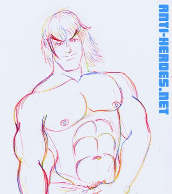
So this week in erotic figure drawing, the model was Reggie, a hard-bodied hunk a actually knew from like 7 years ago. (We were both reluctant Gap employees in the west village!) But given this week’s props and my mood at the time, nothing was going to stop me from turning this set into STREET FIGHTER FAN ART! Bwa ha ha!
 Floppy Elephant Cock version =
Anti-Heroes.net > Members Gallery > Figure Drawing
 Naughty Ballsy Fondle Version =
Anti-Heroes.net > Members Gallery > Figure Drawing
 Massive Erection Strokey Version =
Anti-Heroes.net > Members Gallery > Figure Drawing
Nash (Charlie)

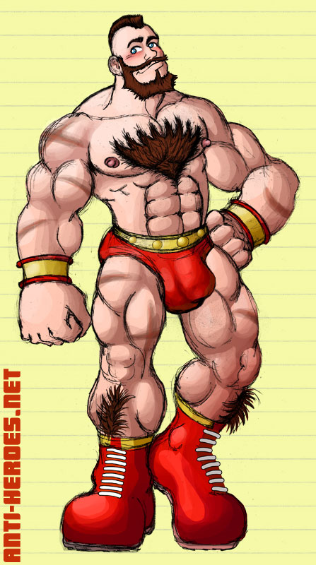
Yeah, I use the Japanese names. Sue me. I’m not trying to be a snob or anything, it’s just that the Japanese versions of the games are what I had growing up. There was a period there where you couldn’t buy U.S. released arcade-perfect versions of Capcom games! You HAD to import the Japanese version if you were an animation nazi and needed every single little frame (me.)
Guile

Ryu

Rolento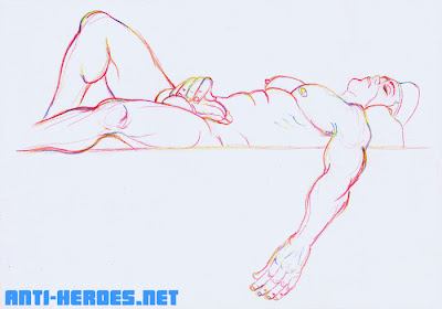

Adon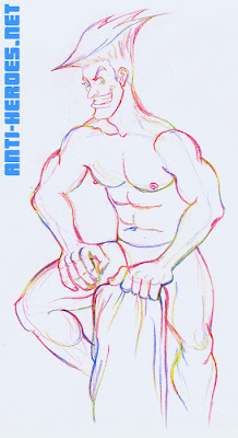

Although I was pretty unimpressed with the latest incarnation of Street Fighter, I will never deny the strength of these character designs. For me, they are some of the most iconic characters of all time.
M.Bison (Balrog)
 Floppy Elephant Cock version =
Anti-Heroes.net > Members Gallery > Figure Drawing
Ken
 Naughty Ballsy Fondle Version =
Anti-Heroes.net > Members Gallery > Figure Drawing
Birdie
 Massive Erection Strokey Version =
Anti-Heroes.net > Members Gallery > Figure Drawing


