When I was 14, I got a scholarship to a snooty private high school because of a test I took. But I absolutely HATED any work that I had to take home with me. I avoided studying and cramming and research like the plague. The only thing that kept me kinda on par with all the stupid little future ivy leaguers was that I was a good test taker. Well, that and my ability to get out of reports by handing in comics and illustration instead!
Pedro y Pablo was for sophomore Spanish class, I think, and I’m pretty sure the official assignment was some kind of research project. I instead chose to write and illustrate a violent children’s book. No fair laughing at my crazy hands and feet, okay? Whaddaya want, I was 14!
Pedro y Pablo 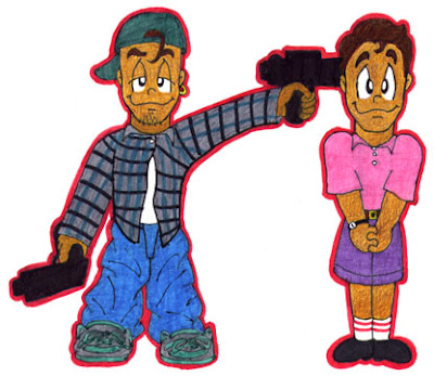
 Habia una vez dos chicos gemelos que eran muy diferentes entre si: Pedro y Pablo. (Once upon a time, there were 2 twin boys who couldn’t be any less alike: Pedro and Pablo.)
Pedro era listo, exitoso y tenia una hermosa novia llamada Raquel. Pablo era malvado. (Pedro was smart, successful, and had a beautiful girlfriend named Raquel. Pablo was evil.)
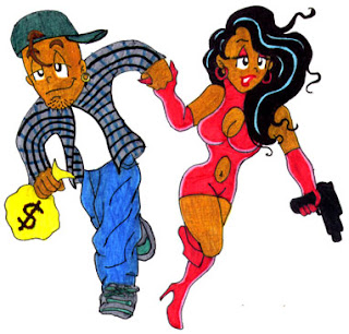
Los padres de ambos sabian que habia algo mal con Pablo cuando mato a los othros bebes en el hospital donde habia nacido. (The boys’ parents knew something was wrong with Pablo when he killed the other babies in the hospital where he was born.)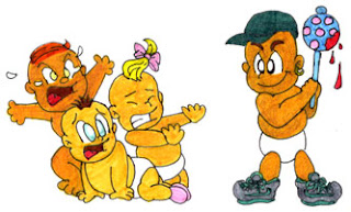 Por lo que se deshicieron de el. (So they sent him away.)
 Pablo se convirtio en un ciminal y asi un dia acabo en la carcel. (Pablo grew up to be a criminal and was eventually locked up.)
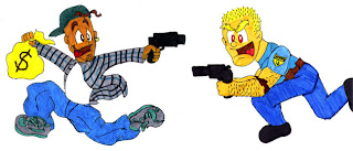 Los siquiatras de la prision, sin embargo, diagnosticaron que la maldad de Pablo ero producto de genes defectuosos y una mala crianza. (However, prison psychiatrists said that Pablo was evil because of bad genes and faulty parenting.)
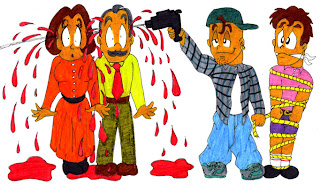
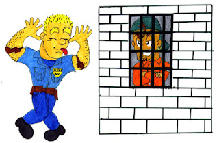 Cuando salio de la carcel Pablo se vengo de sus padres pegandoles un tiro en la cabeza. Luego ato a su hermano y lo escondio en el baul del carro. (When released, Pablo took revenge on his parents by shooting them in the heads. He then tied his brother up and hid him in the trunk of his car.)
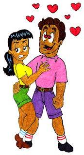
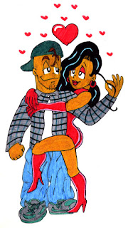
 Pablo se posesiono de la vida de Pedro. Convirtio a sus amigos estudiosos en gangsters y a Raquel en una prostituta. (Pablo took over Pedro’s life, turning his nerd friends into gangstas and Raquel into a ho.)
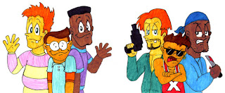
 Pero con su nuevo novio, Raquel se sintio llena de vida. Juntos se embarcaron en una ola de crimenes. (Raquel finally felt alive with her new man. Together they went on a crime spree.)
 Cuando por fin lorgo escaparse, Pedro intento retomar el control de su vida pero Raquel le metio un tiro en la ingle. (When Pedro finally escaped and proceeded to take his life back, Raquel shot him in the groin.)
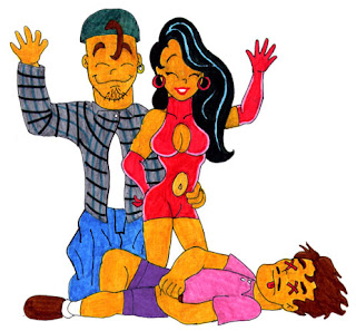
 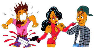 La moraleja es que no vale la pena ser bueno en la vida. (The moral of this story is that it does not pay to be nice.)
 Yeah, I am pretty embarrassed about the ridiculous violence in this. What can I say? The late 80’s and early 90’s were all about blood and giant automatic weapons. That was “in.” Also, back then, being in the closet, I felt that I definitely needed a “hook” or “trademark” for my work to detract for any ambient gayness it might exude. The shock value of gratuitous violence was my hook.
Now it’s fat penises.


 Basically here are some of the reference materials I use.
 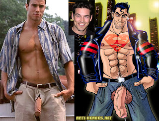 Some are pics from the internet, rough CG models from my partner, and some are photos of me!
  Sorry I’m censoring my face and bulge in these.
 I do however want my pecs to be appreciated though– haha!


