
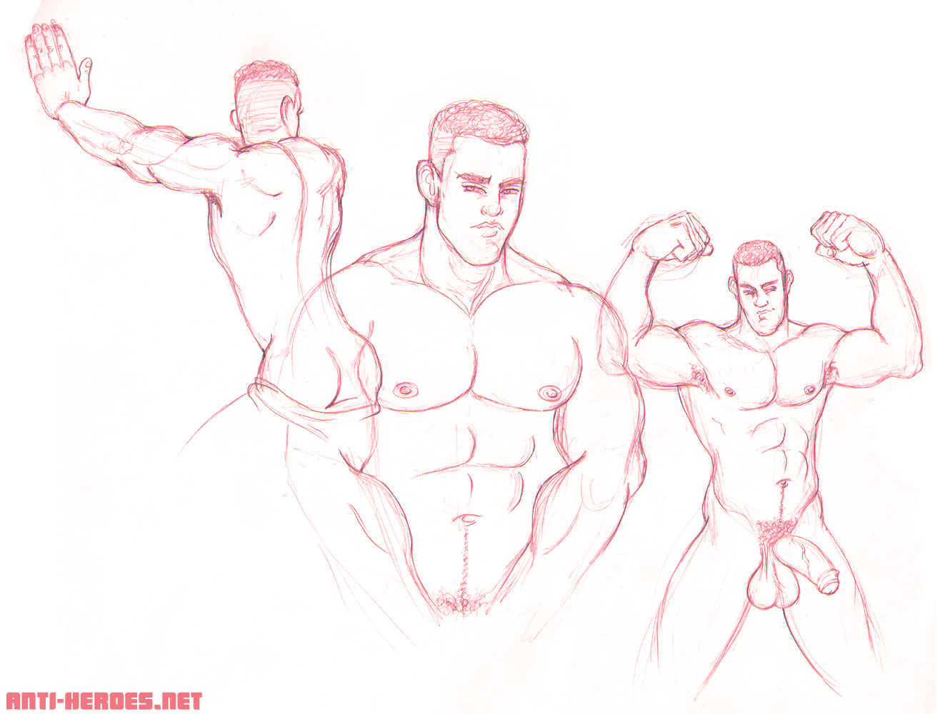
Jonny is a tall, hunky stripper with beautiful lips, nice meaty tits, and a big floppy piece of manflesh between his legs. He also has these gorgeous devilish eyes that make him do that sexy look Tyra is always demonstrating for the girls on Top Model– haha.
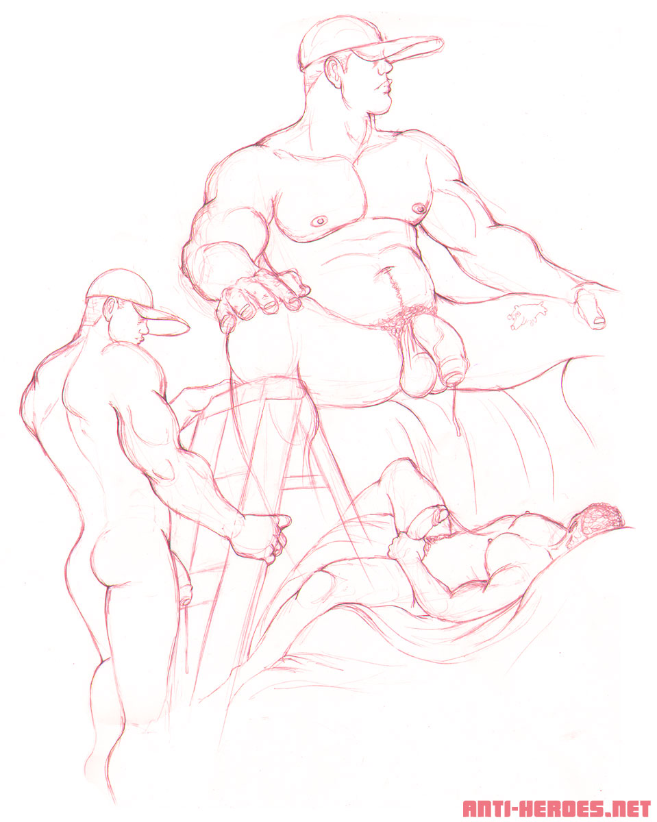
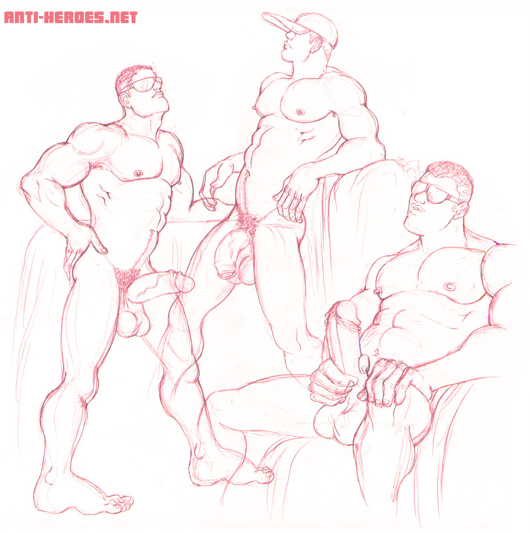
I wanted to work largescale this session so I brought some bignormous paper. But it’s just not in my nature to draw so huge. So instead, I incorporated more than one pose onto a page. It ended up being 3 poses for 3 pages and made for a really interesting collagey sortof look.
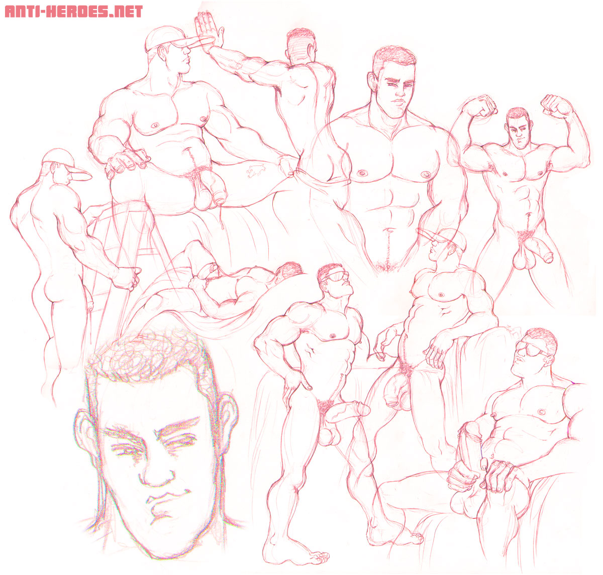
Then, to culminate this idea, I put all 3 drawings together using Photoshop to create one huge overlapping layout of smooth beefy sexiness. And by the by, you’re getting the ENTIRETY of the Jonny set here on the blog. No half here, half somewhere else. 😀


