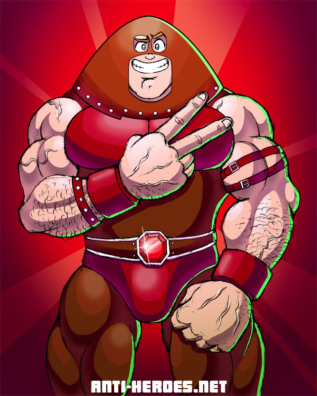
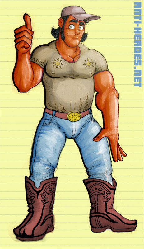
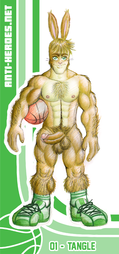
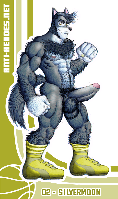
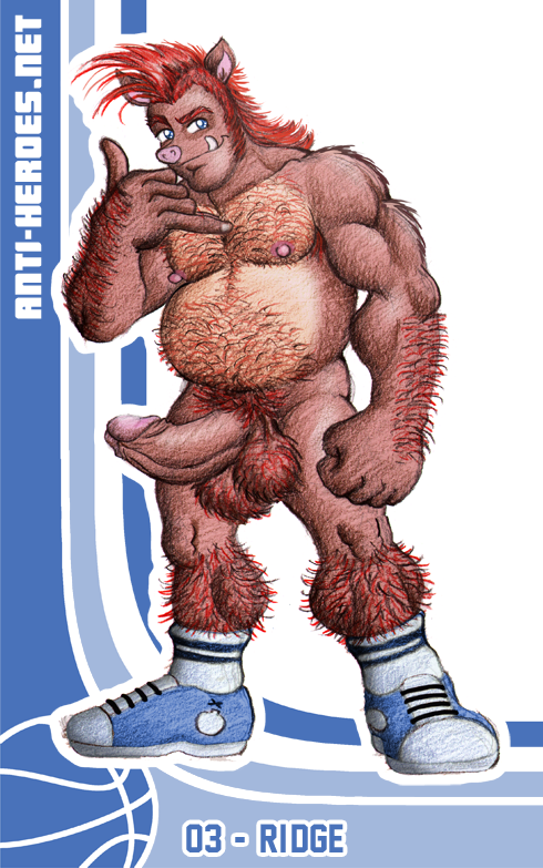
All posts by JC
Mortimer Toynbee— or Toad, as most of us know him, was never one of my favorite villains in the X-Men universe. Nevertheless, I’ve decided to draw a cute fan-art of him because he’s an X-Men staple, and when written / drawn well, he can be a pretty cool addition to the wide wonderful super mutant world. There’s a gooey nudie version on my site Anti-Heroes.net in the Fan-Boy section. Here’s the thumbnail!
The thing about him is, I like different aspects of him from different X-Men media. Like, I like the retooling of his powers in X-Men the first motion picture, his look and personality in X-Men Evolution, and his voice actor in Pryde of the X-Men. The fact that so many different perfectly valid instances of this one character exist got me to thinking about one of my main gripes with the franchise in general.
My problem is and has always been the inconsistency with different instances of the same character. I used to go on these huge rants about how goth Rogue in X-Men Evolution is wrong, or how non-speaking Storn in Wolverine and the X-Men is wrong, or how broken-english, slow-acting Colossus in every media that’s not the comics is wrong.
I’ve now come to finally realize that depending on the interpreter, the characters in the series can be written and drawn ANY FRIKKIN’ WAY THEY WANT. Nowadays there is no one correct way to interpret X-Men. They can be as far away from their original iteration as possible and it’s PERFECTLY OKAY.
Wolverine can be the level-headed leader. Cyclops can be the loose cannon. Emma can be the mom. Storm can… not exist. You can’t get mad anymore– the characters are more like… guidelines. You can’t say “Oh, Nightcrawler would never do that.”
I know this may seem kinda obvious to some of you but I was kinda hung-up on what I saw as bad interpretations of my favorite comic series– even modern issues of the comic series itself. Am I over it? Nah– but I think I much better understand why it’s happened now. And to cope, I’ll just continue to draw them all gay with drippy dicks.
For this week’s figure drawing session, there was another pair of guys. One was James, whom I’ve drawn before, and the other was a new guy, also named James. When drawing two guys, though, it’s difficult to get a good facial likeness along with both whole figures. So, for this session, I drew the bodies and left the faces blank, to complete at a later time.
So then, after having the drawings for a little while, I ran through the list of likely muscley couples to turn these into. All-American and Golden Boy didn’t enter my mind for a while because it’s been so long since I’ve drawn them. But once I started the process, it seemed so perfect and natural that these drawings become this sexy duo!
3 of 6 up here. The rest you’ll find in the Figure Drawing gallery on Anti-Heroes.net.
Here’s a caricature of our riding instructor. So cute– he had the prettiest hazel eyes. Rollover for the surprise!
Because, of course, since I don’t already have enough characters (heh heh) here’s some new ones for ya!
I could never really put into words how I felt about furry. 8 or so years ago, I guess it kinda turned me off… but I couldn’t help but marvel at the work of some of the furry artists. Slowly but surely, some furry pieces here and there would cause a bit of a stir in my pants. And now, in my perverted old age (22– heh heh!) I’m completely into it!
So yes, Layup is a series of sexy anthro men who play in a sexy anthro b-ball league! Tangle is the first one I drew. It was a little tricky drawing a bunny who’s not Buster or Babs, but hopefully I succeeded in making him look different than them. Next up was SilverMoon. I knew I wanted to tackle a wolf early on because they’re a mainstay of all great furry artists. And lastly came Ridge, the boar, simply because I wanted to do a species that I don’t really see that often. Of the 3, I’m leaning toward Ridge as my fave. Don’t forget to rollover each char for the stiff dong version. Special thanks to KittMouri for the names.
There will be more Layup boys, for sure, but I’ll introduce them intermittently. So don’t worry, I’ve not become a furries-only artist. Just wanted to show you guys just how wild I can get. 😛
This piece was completed in part due to the user VicCreed on DeviantArt. After coming across this piece, I was taken not only by the drawing itself, but by the artist’s immense adoration for Sabretooth. VicCreed’s drawing shows that he thinks Sabretooth is hot for the same reasons I do– the stature, the fuzziness, the attitude… mmmm.
Anthony Gonzales put me up to the challenge. He basically said that I’ve been using the computer too much and that it’ll be good to show that I still CAN work in traditional media. So I dusted off the ol’ colored pencils and markers, got a pad of brown paper (because stuff just looks so much more arty and bohemian on brown paper,) and got to work!

Basically I just reworked some of my sketches from the figure drawing workshop I go to. Right now though, I feel like I am at a crossroads with where to go with my art. I really like what I’ve done with the colored pencil and marker here, and I definitely want to keep exploring this style of color. But I also want to get much better at digital coloring. I’ve even been thinking of taking a class (I’m looking into this online course by this amazing dude I see at comicon.)

So I don’t know what the future really holds for this stuff. I want to say that I’ll continue to explore different types of media and have a wide variety of different styles for you guys. But who knows– maybe I’m just hitting the tip of the iceberg and 2 years from now you’ll be seeing nothing but giant oil paintings on this site…. HAHA (yeah that’ll happen -_-)

The Good:
It’s a new Street Fighter!
The Bad:
The roster is too small and the characters’ move lists have been greatly reduced. Both of these were conscious decisions by Capcom to make this game more like Street Fighter 2. They are trying to recapture the Street Fighter 2 fanbase and ignoring fans of the Street Fighter Alpha or Street Fighter 3 series’.
The Ugly:
As a big fan of 2D art forms, I always had my qualms about the main Street Fighter canon going 3D. Indeed, a valiant effort was made to preserve the art style of the older Street Fighter games… but it wasn’t enough for me. The 3D character models are clunky and awkward. Admittedly, some of the 3D models are much better than others. Ryu and Ken (of course) look amazing. But there’s something kinda… doofy about everyone else. Whether its the animation or the model itself, none of them have the grace and elegance of the 2D Street Fighter sprites.
For me, there is a huge disconnect between the beautiful calligraphy inspired promotional art, the clumsy in-game 3D models, and the traditionally animated “Pokemon-esque” story elements in the game.
Obviously an effort was made to link the calligraphic promo art style to the 3D models because here and there the 3D models get what looks akin to a black brushstroke ink outline. But the brushstroke effect is too little and happens too rarely in the game to match the beautiful promo art.
And then there are these weird cartoon cut scenes that look as far away from the promo art and 3D models as you can possibly get. The animation is limited and character design is over-simplified and completely off-model. It literally looks like Pokemon to me. These little mini-toons are supposed to tie-in to the Street Fighter 4 animated movie, done in the same style. Personally, I think they should’ve kept these cut scenes out of the game. It gets too mis-matched.
In previous Street Fighter games, the promo art, gameplay art, and story art all looked like they were done by the same hand. That brought a sense of cohesiveness and gave those games a tight, complete feel.
In conclusion, yah I’m playing it like crazy because it’s a new Street Fighter. But I’m constantly wishing I had more characters and more moves. It pains me to look at a lot of it. I skip the story scenes. Whenever I have to fight Dhalsim, I try to beat him as quickly as possible because I hate that 3D model. What’s wrong with him? Is the head too big or something? He looks like a baby. None of the new characters impress me that much. El Fuerte is welcome, I guess, but kinda… expected. C.Viper I find boring. I mean, come on, ANOTHER female agent character? Rufus is stupid and a little offensive. Everytime I have to fight him, I get sad that so much effort was put into him while E.Honda, the original fat guy of the series has been totally ignored.
Abel is cute… sometimes, but again, somewhat yawn inspiring. His outfit is lame, he’s got redundant moves, and his personality puts me to sleep. It’s a good thing he has that alternate singlet outfit or else he would have never made it to my sketchpad! hehe! Enjoy this drawing and the raunchy NUDE, ERECT rollover version. (Oh, and sorry Doug. He’s French and French people don’t circumcise.)

For my 2nd go at Adam, I tried to take a little more time and get a little more artistic and experimental than jut my usual graphite pencil on white paper. So these are graphite pencil, white colored pencil for highlight and a little black ink on orange and red construction paper.

You’d think that what turns me on about this guy are his big beautiful smokey brown eyes… or his soft, supple, toned muscular bod… or his cute little perky bubble butt… or his mouth-watering fat curvy tool… but no, it’s none of those things. It’s the nose! I am in love with this man’s nose! It’s just so… distinctive and pronounced– but not huge and ugly. It’s in perfect proportion– but still a strong and proud nose! Is this weird? Probably– I just called someone’s nose strong and proud…

3 of 6 here on the blog. The rest are in Figure Drawing in the Members Gallery of Anti-Heroes.net.
10) Frylock
on Aqua Teen Hunger Force
8) Sugar Bear
of Super Golden Crisp cereal
7) Lex Luthor
on Superman the Animated Series
2) Mother Brain
on Captain N the Game Master
Ah yes, good ol’ Panthro. Always so tough and masc and just plain cool. Did you know that he was voiced by the guy that played Grandpa Huxtable on the Cosby Show? Weird huh? Well, enjoy my sultry version of this classic stud below:
My experience in the U.S. wherein blacks are a minority, has caused me to feel a responsibility to include at least one major black character in every set of illustrations / characters I create. Some might call this tokenism, but I don’t think that necessarily has to have negative connotation. Growing up, I was always more apt to consume media that included your “token” black character. I saw these media as integrated, which was important to me.
Tokenism is bad when the black character is a stereotype or when OTHER token traits are applied to him. Like when the token black character is also the token nerd… or token fatty… or token midget… or token foreigner… or token indeterminate race character. Instances like that single the character out, which is counter-productive to the idea of their inclusion in the first place.
Rant, rant, preach, preach, I know, I’m sorry. But I swear, if I see another show where the black one is a wimpy awkward skinny ugly geek with big-ass glasses, I’m going to stab myself.
Anyway, enjoy this latest drawing of Caleb, the black Anti-Hero. I hope what I’ve done with this guy is create a character who is defined by more than his skin color. He’s the brain and the leader, which for me naturally progressed to become this sort-of bossy megalomaniacal mercenary. He’s also very handsome and knows it, like he knows everything, but doesn’t flaunt it. He prefers to flaunt his intelligence and commanding personality. And… his dick. That’s one stereotype I’m happy to perpetuate.


