Street Fighter IV came out a few weeks ago, and like any die hard Street Fighter fan, I had the deluxe edition on pre-order and have been devoting as much time as I can to intense study of the game.

The Good:
It’s a new Street Fighter!
The Bad:
The roster is too small and the characters’ move lists have been greatly reduced. Both of these were conscious decisions by Capcom to make this game more like Street Fighter 2. They are trying to recapture the Street Fighter 2 fanbase and ignoring fans of the Street Fighter Alpha or Street Fighter 3 series’.
 The Ugly:
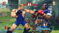
As a big fan of 2D art forms, I always had my qualms about the main Street Fighter canon going 3D. Indeed, a valiant effort was made to preserve the art style of the older Street Fighter games… but it wasn’t enough for me. The 3D character models are clunky and awkward. Admittedly, some of the 3D models are much better than others. Ryu and Ken (of course) look amazing. But there’s something kinda… doofy about everyone else. Whether its the animation or the model itself, none of them have the grace and elegance of the 2D Street Fighter sprites.
 For me, there is a huge disconnect between the beautiful calligraphy inspired promotional art, the clumsy in-game 3D models, and the traditionally animated “Pokemon-esque” story elements in the game.
Obviously an effort was made to link the calligraphic promo art style to the 3D models because here and there the 3D models get what looks akin to a black brushstroke ink outline. But the brushstroke effect is too little and happens too rarely in the game to match the beautiful promo art.
 And then there are these weird cartoon cut scenes that look as far away from the promo art and 3D models as you can possibly get. The animation is limited and character design is over-simplified and completely off-model. It literally looks like Pokemon to me. These little mini-toons are supposed to tie-in to the Street Fighter 4 animated movie, done in the same style. Personally, I think they should’ve kept these cut scenes out of the game. It gets too mis-matched.
In previous Street Fighter games, the promo art, gameplay art, and story art all looked like they were done by the same hand. That brought a sense of cohesiveness and gave those games a tight, complete feel.
 In conclusion, yah I’m playing it like crazy because it’s a new Street Fighter. But I’m constantly wishing I had more characters and more moves. It pains me to look at a lot of it. I skip the story scenes. Whenever I have to fight Dhalsim, I try to beat him as quickly as possible because I hate that 3D model. What’s wrong with him? Is the head too big or something? He looks like a baby. None of the new characters impress me that much. El Fuerte is welcome, I guess, but kinda… expected. C.Viper I find boring. I mean, come on, ANOTHER female agent character? Rufus is stupid and a little offensive. Everytime I have to fight him, I get sad that so much effort was put into him while E.Honda, the original fat guy of the series has been totally ignored.
 Abel is cute… sometimes, but again, somewhat yawn inspiring. His outfit is lame, he’s got redundant moves, and his personality puts me to sleep. It’s a good thing he has that alternate singlet outfit or else he would have never made it to my sketchpad! hehe! Enjoy this drawing and the raunchy NUDE, ERECT rollover version. (Oh, and sorry Doug. He’s French and French people don’t circumcise.)

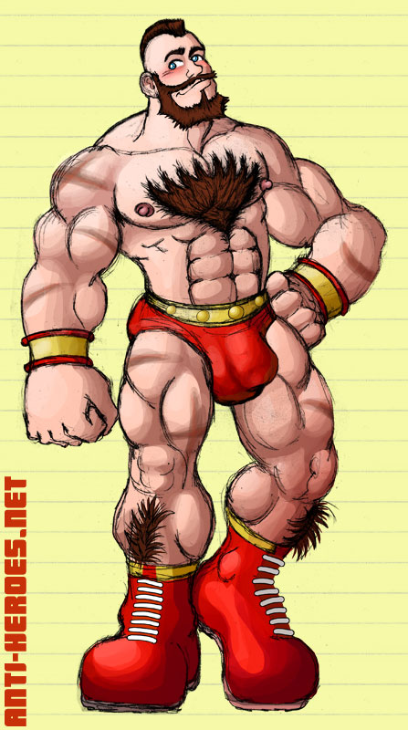
 This piece was completed in part due to the user VicCreed on DeviantArt. After coming across this piece, I was taken not only by the drawing itself, but by the artist’s immense adoration for Sabretooth. VicCreed’s drawing shows that he thinks Sabretooth is hot for the same reasons I do– the stature, the fuzziness, the attitude… mmmm.


