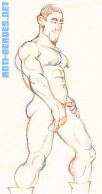
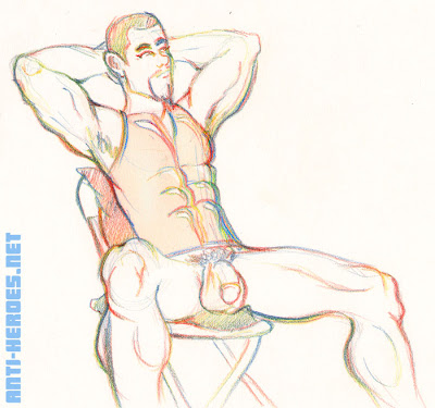
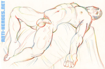
Case in point: I was pleased to find the photo of this week’s model, Luc in my e-mail inbox. Thin, young, and smooth, he was lying on a bed, draped in white linens, which only covered a small section of his flacid uncut peepee. So, I packed up my pink construction paper and geared up for a night of barely legal twink-themed fun.
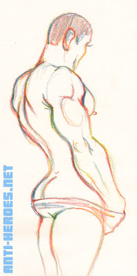
I don’t know what the deal was but if you put that picture next to the guy I drew that night, you would not think they were he same dude. Either that pic was several years outdated or Luc just recently hit puberty. Granted, he was still thin and smooth– but his face… was just way more masculine than in that pic. He had a big ol’ man chin! It totally threw my twink mindset off.
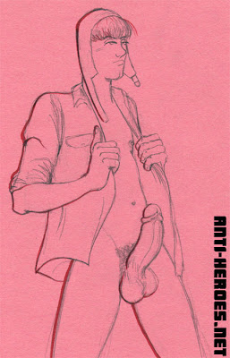 And yeah, he had a humongous dong. Like huge. You guys know me, I don’t normally get freaked by big cocks. But this one really surprised me– not because of his build– cuz I’ve seen plenty of twinks with huge cocks. It surprised me cuz in that pic, it was SOOO tiny!
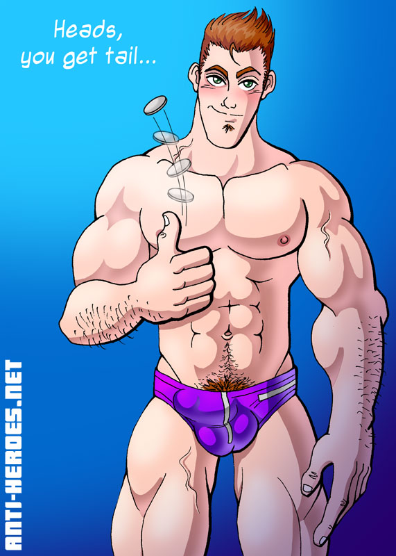
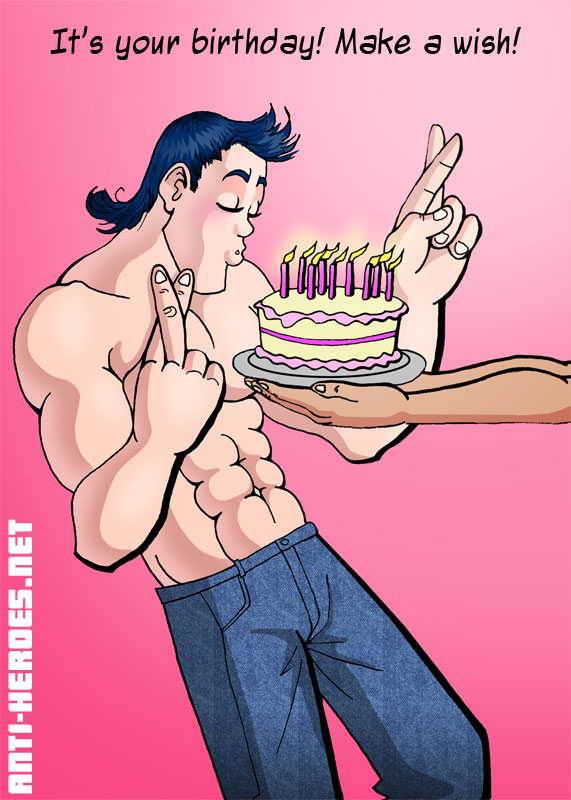
So, me, wanting to be true to this model, drew a kinda svelte, kinda young, square jawed man… with a gargantuan boner. But the other artists weren’t having it. They came to draw a boy and by-golly they drew Luc as boyish as possible! I dunno, maybe that’s just how he looked in their eyes. But some artists totally made up his dick out of their heads, drawing it much, much smaller than it was. Shit, if I was modeling and someone drew my dick an eighth of it’s size, I’d be kinda pissed.
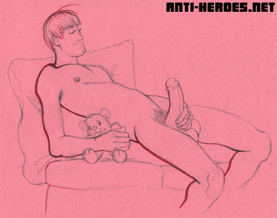 And no, teddy is not made up. During set-up between poses, one of the artists says jokingly to the director, “So when are you gonna break out the teddy bear?” The director replies, “Should I? I did bring one…” And sure enough, the director brings out a teddy bear for Luc to cuddle while jerking off.
 In the end, the class was full of drawings of little boys, and many of the artists were somewhat disturbed by them, claiming they’re going to have to shred them. Not wanting to take them home, Anthony sold a couple of his drawings right there on the spot.
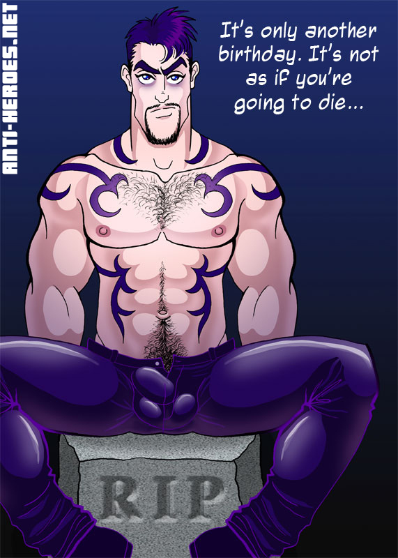
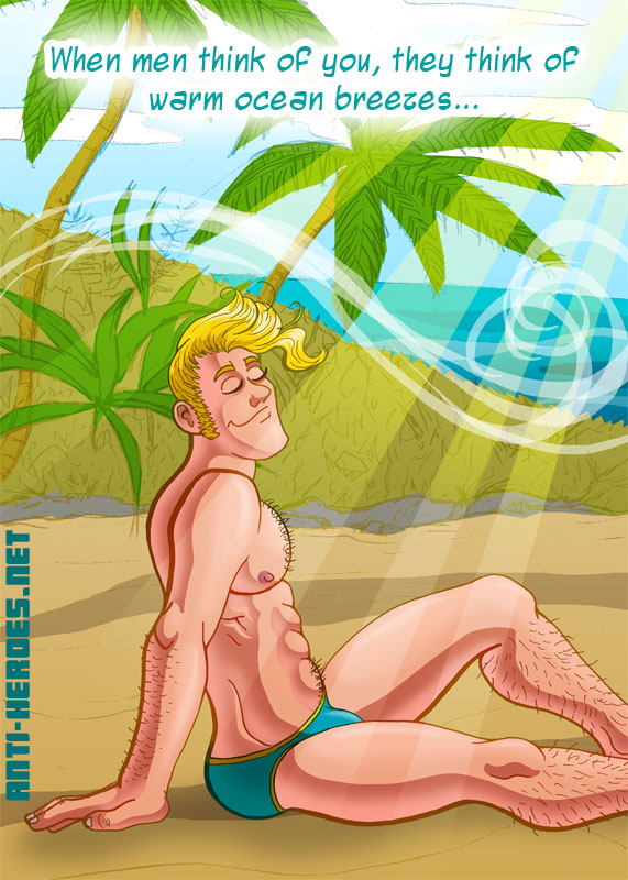
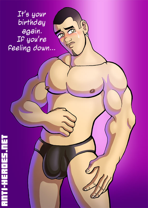
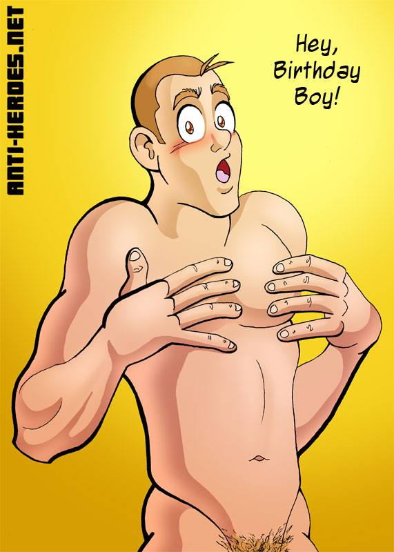
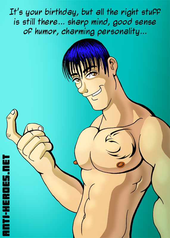
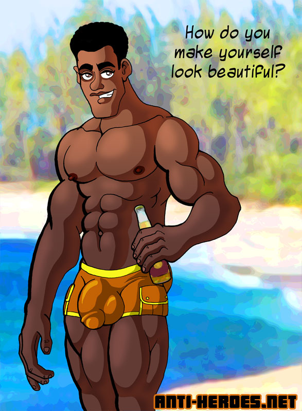
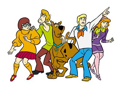
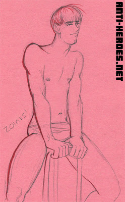 And I guess mine were boy-ISH, but not nearly as shota-tastic as the rest. In fact, a few people noted that my drawings of Luc looked a little like Shaggy from Scooby-Doo. Hence the “Zoinks.” 4 up here, 4 more in Figure Drawing on Anti-Heroes.Net .


