 If you’ve ever visited my older site (the non-erotic one,) then you might have noticed a series of pieces starring these girls I call the Pretty Pose Pom Pom Posse.
 The Posse began as a fleeting idea I had in college. It’s basically a send-up of one of my favorite Japanese anime series, Sailor Moon. A friend of mine got extremely upset that I’d draw cheerleaders in high heels. She didn’t get that was one of the jokes.
(Right: Pom Pom Posse Beginning; circa 1999)
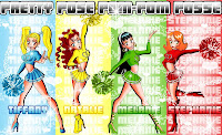
 The core group began as just four girls. Tiffany was the ditz, Natalie was the leader, Melanie was the brain, and Stephanie was the ho.
(Right: Pom Pom Posse Portraits; circa 2000)
 I think it was my junior or senior year when I got a portfolio review by a guy at TokyoPop. He liked my work and encouraged me to submit something starring the girls. From then on, the Posse has been a work in progress in my head.
(Right: Posse Group Hug; circa 2000)
 The first thing I did next was design Brittany. I had always felt a little hypocritical not including a brown character in the mix, being someone that is a huge proponent of diversity.
(Right: 1st Brittany; circa 2002)
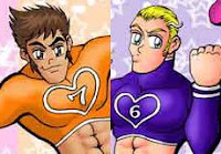 Then, since I desperately craved a few male characters in this thing, I created Jeremy and Zachary. But then I quickly tired of the idea of male cheerleaders and removed them from the squad (but not from the storyline.) Jeremy, the brunette, is a hot shot heartthrob on whom all the girls have crushes. Zachary, the blonde, is Jeremy’s best buddy but more uptight than anyone else.
(Right: Jeremy & Zachary; circa 2002)
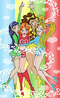
 The girls underwent many revisions in my sketchbook, but this design for them is the most recent. Natalie gets a new hairdo and becomes a lot more of a snarky bitch while Brittany loses the dreadlocks but remains a no-nonsense tough broad.
(Right: The New Pom Pom Posse; circa 2008)
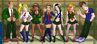
Upon seeing the movie D.E.B.S., (which is a-fucking-mazing… in a campy “aww this actually got funded” kinda way) my fetish for prep school uniforms was restored. So below are the versions of the girls and boys when not in Pom Pom mode.
(Below: Pretty Posse Preppy Type; circa 2008)
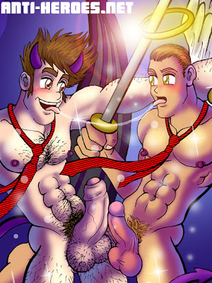
 I won’t go into too much of the plot here, but I will tell you that one of the reveals is that Zachary and Jeremy not only have their own special transformations but also, of course, have the hots for each other! The drawing below was more for me than the actual story, being that the plot is kinda all-ages as I see it.
(Below: Devilishly Heavenly Detail; circa 2008)
 But this is precisely why this series never went anywhere. I just don’t have the drive to finish it cuz it’s not porn! 🙂 Someday…
(Below: Devilishly Heavenly Wallpaper; circa 2008)


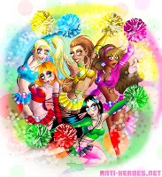
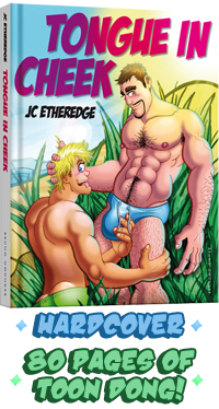
 2 more pin-ups from Anti-Heroes #3, on sale next month!
 This book focuses heavily on Caleb… Good news for you guys who like cute megalomaniacal genius black man-machines with enormous cocks!


