Hey gang. So any follower of the gay erotic art scene should know IcemanBlue‘s work. He’s perhaps best known for doing long-format, super detailed, erotic web-comics featuring some of our favorite beloved mainstream characters. He’s made such a prominent name for himself over the years with the fan-art, most of his followers were heavily anticipating when he’d come out with some original characters.
Left: MidnightMan by IcemanBlue
That he has, and among them are MidnightMan. He is a Tomb Raider / Secret Agent and is the subject of the artist’s first printed work. Iceman’s gotten some of the most prolific artists in our field to do pin-ups of MidnightMan, including yours truly. Enjoy!
Some of you have noticed that my erotic art goes through “phases.” A few years ago, I was experiencing the height of my “cummy” phase where I’d cover my cartoon studs from head to toe in semen. Right now, you could say that I’m in my “monster balls” phase. I have discovered that I have a fetish for large heavy nutsacks. It’s become something that I try to emphasize in my work. So, you can imagine my delight to discover this week’s workshop model, Tyler, a man naturally blessed with enormous testicles.
In general, I was very pleased with Tyler. His pic looked nothing like him (as usual) and showed him with short black hair and a completely shaven chest. So it was a awesome to see that in reality he was a redhead. I have a bit of a thing for the gingers. And what a bonus to discover he was really super hairy, something I’ve come to LOVE in these past few years. But as I said before, it was undeniably that huge pink bag between his legs that kept my mouth agape and cock hard the entire night.
I tend to find something attractive about all of the models who make it to my blog. But I think this guy was the first one I was actually attracted to. At one point during a break, he was walking around with a long line of precum dangling from his dickhead. You should have seen how tongue tied I got when he tried to make conversation.
3 of 7 here on the blog. The rest are up in Figure Drawing on Anti-Heroes.net.
Aw, lookey here– I’m giving youze your update a whole day early! Hee hee!
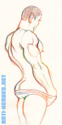
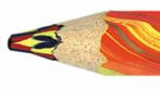
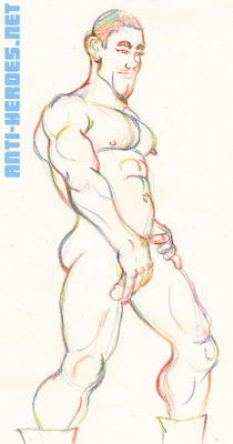
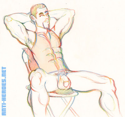
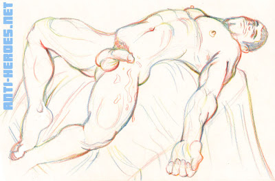
This week I give you James, another of the workshop’s beautiful models. I’ve drawn him with this crazy multicolored pencil I’ve recently acquired. Have any of you guys seen this thing?! It’s pretty awesome-tastic. It’s one pencil but the lead has 3 different colors randomly infused into it. So, depending on at what angle you draw, the color will change– like mid-stroke! INSANITY!
4 of the 9 drawings are posted here. The rest are in the Members Gallery of my site.
Now, on to James. The one word I think describes him most perfectly is… etherial. His features just look… not of this world. Don’t get me wrong, it’s not a bad thing. It’s a very mysterious and unique look. Like, if we were in Middle-Earth, he’d definitely be an elf. His adorable grin seems to light up a room. You like– picture flowers sprouting where he steps.
James also has a hard, solid, seemingly marble-sculpted body. But somehow, even with all those muscles, he doesn’t come off bulky. Maybe it’s becasue he’s short and the proportions just all seem to fit.
I’ll make this confession: I am very very behind in keeping you dudes up to date on the erotic figure drawing sessions I’ve been attending. One reason for this is because the workshops are weekly and it’s just really hard to keep up. The other reason is that I like to have a backlog of material for the blog and my site– particularly in times of… uncreativeness.
And so yeah, I kindof don’t remember the model from which these were based. All I remember is that I probably wasn’t really attracted to him, which is why I turned each of his poses into a hot Persuasions character!
Wow. Nearly 2 years ago, I started this blog as an experiment– not really expecting it to last– not really expecting my interest with it to stay- not really expecting anyone to read it. And now, here I am, 100 posts later, and blogging has become my favorite aspect of my erotic art career!
Blogging has taught me a great deal about the direction I should be going with all this. I know I want to get better, and I know I want to give you guys the artwork YOU want. That’s what gets me off– drawing what turns you guys on!
Hence this celebratory piece. Last time you saw Ryan, our beefy god of thunder, he was rocking out, electrocuting his mighty dong. I know he’s the favorite of the Omega Phi fratboys, and thusly he’s become my favorite. Here, he’s perhaps wrapped up a morning run or gym workout and has stopped to pose and show us his awesome power. Not one for modesty at all, Ryan loves showing off and very much enjoys his devoted following.
Soooo, thanks for giving me the strength and motivation to keep working! I’m here to deliver PORN 4 U!
PS: You may have noticed my sites were down most of the week. My lovely webhosts just up and… do that sometimes. If you tried to e-mail me during that time and it bounced back, please re-send now.Yeah, it’s pretty maddening. I am correcting the issue as I type– rest assured heads will roll.
Many apologies for the long-time lack of updates, my fine feathered friends. I’ve been busy (as usual, blah blah blah– I know that’s been my mantra lately.) But along with an overhaul of the main site, finishing up issue 3, and maintaining the dreaded 9-5, I’ve been working on another top-secret project which will be frikkin’ amazing if it comes to fruition.
Today, I give you beautiful Adam, one of the regular models at the workshop. This guy is popular. When he’s there, EVERYONE shows up. I admit, even I was impressed the first time I saw him. For one, he actually looks like the preview picture he sends out. I can’t tell you how often it’s the case where the model looks nothing like the photo.
Adam looks to me kinda Italian-ish, but I really don’t know his ethnic heritage. He is fun and challenging to draw because he has these very unique features that sound like they’d make for a weird-lookin’ guy. He’s got a pronounced parrot beak, smoky eyes, and his dick is kinda… twisted. But he is absolutely gorgeous– solid muscular bod, thick dark hair in all the right places, and a tight little butt that makes me salivate. All of his features together make up this stunning… scrumptious… perfect.. DEITY of masculinity. I exaggerate not. He is often depicted as Jesus in some of the other artist’s work.
He’s also a very nice guy. Humble, smiles a lot, and I can tell he genuinely gets off on having all these guys swoon over him. I almost feel a little bad that my drawings don’t capture how hot this guy is. Well, at least I got his awe-inspiring reverso-cock correct! You guys– it is absolutely amazing! Great to watch it go from soft to hard. I mean, when it gets hard, it looks pretty normal with a typical curve. But soft… you totally wanna pick it up and like… twist it.
For this series of drawings, I really took the time to get to know these new water based markers I’d bought the week before. They don’t blend as well as the alcohol based ones but this particular brand does boast a few other assets. For one, they have a brush tip, allowing me to create lines that look a little like brushstrokes. That’s kinda cool.
The model was a first-timer by the name of Tony. Admittedly, I am not the hugest fan of PA’s, but it was fun to draw something new down there.
So just when I’d gotten used to drawing my little caricatures of Tony, we were treated to an added bonus– namely Brandon! Two for one!
Brandon, or the walking rug, as Wabbit called him, looked a lot more buff than I remembered. He also seemed very into Tony.
A note on this final drawing: talk about challenging! The models were so hot for each other that once they really got into it, they couldn’t hold still for nothin’! It’s so difficult to draw two bodies in perpetual motion that a lot of the other artists simply gave up. But youze guys know I’m a fuggin’ TROOPER and managed to produce something that I’m actually quite proud of. I feel like I really captured a sense of movement there.
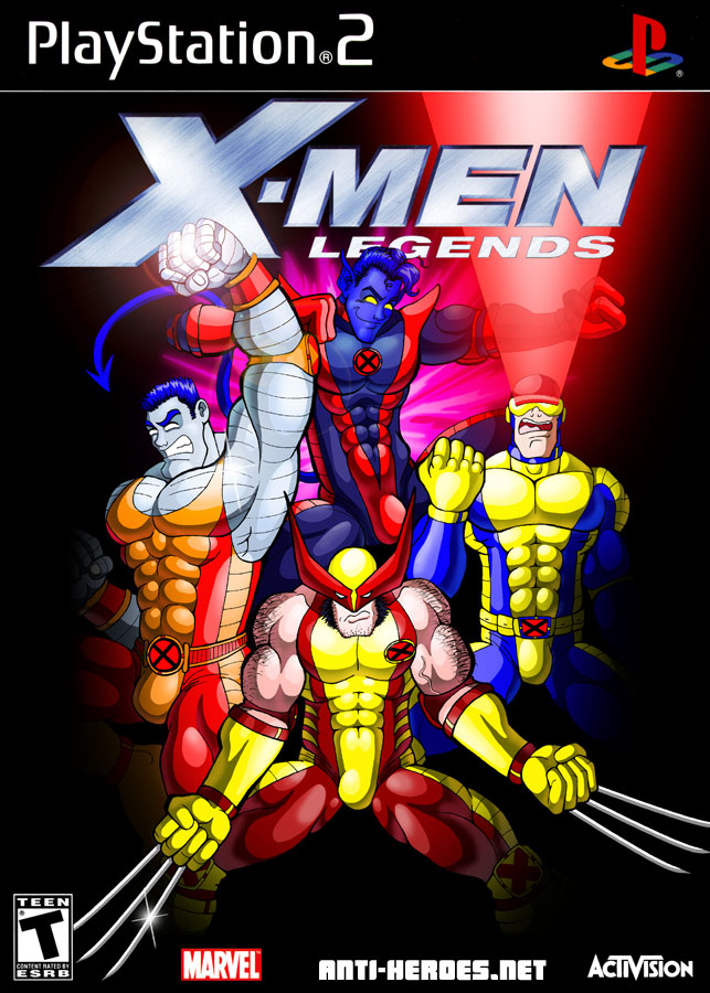
Weeks ago, when I polled you guys about which video game cover I should redo, I thought that I’d get some varied responses. Silly me must have momentarily forgotten how uber-popular X-Slash is here in Netland. X-Men Legends led the poll overwhelmingly from start to finish. (Sorry, Link fans, you’ll have to wait.)
X-Men Legends is a great game but it suffers from a syndrome from which most X-Men games suffer: a boring cover. Cue my redo. Choosing which characters to use was easy enough. I picked the 4 most iconic characters (all male of course, as this is the secret SEXY GAY version of the game.) Deciding to use the costumes I designed for them was also a quick decision. I figure, if everyone and their mother gets to do it, I should, being a devout fan and historian for decades.
The tough part was figuring out what they should be doing and how to pose them. I mulled through a myriad of different ideas, but none of them seemed as solid as the classic X-Men splash image. You know, the type of drawing that sells millions of comic books and never fails to make fans kick themselves after discovering that only one or two of the characters from the cover are actually in the book. haha.
I also had issues deciding how exactly to make this XXX erotic (particularly because I’d already drawn them all fully clothed!) I never tire of my rollover images, so I went with that, along with that cool glowing “X” that serves as the x-ray vision peephole for you guys. I have to say that even though he is not my favorite of the 4 I chose, I am most pleased with Logan in both the clothed and raunchy versions. I think after days of mucking around with it, I finally captured that Logan snarl!
I expect massive amounts of feedback, people– this is X-MEN FAN-ART here. ^__^
So who knew when I said I’d love fan-art for my birthday that so many of you guys would do it?! I feel so special! I can’t tell you guys enough how much I appreciate it. It’s such a joy to see characters I’ve created get rendered by other artists. It’s like– the ultimate affirmation that my audience actually understands what I’m doing with all this. It never ceases to amaze me that people “get” my characters. So, once again– big thanx to everyone who turned out these mini masterpieces!
I love how RedValkyrie captured Toni‘s extreme beauty and femininity here:
And then here’s Tai, who is perfect for someone like Wabbit, who has a talent for drawing cute manga faces combined with the manly muscles of western comics:
Finally, I’d like to introduce you all to a phenomenal artist I’ve only recently just met. Anthony Gonzales was perhaps one of the first people to become friendly with me in these drawing sessions I’ve been attending. I noticed his awesome work in the class the first few times and then, one time he brought in his XXX portfolio of personal work. I must say, I was completely in awe of this traditional master renderer with his genuine love and understanding of the male form. He uses mixed media and when I say mixed– I mean MIXED! For example, many of his pieces featured beautiful African-American men with their “bling” done in metallic shimmery marker and sometimes even glitter! And he had this other piece where this guy was drinking spunk from the “tap” and it was done with Elmer’s glue! So brilliant! He gave me one of the pieces, shown below. I like to think it’s my character Drakaar from Persuasions. hehe
And then for my birthday, Anthony brought in these two pieces from which I’m still freaking out over. First up, we’ve got Paxton giving it to Tai, wondering if Caleb‘s unit will fit in as well! Look at the subtle detail in Paxton’s legs.
Next is Nuke and Preston marveling at the wonderful job they’ve done of sodomizing poor Jehosaphat. I especially dig the realism and expression that went into Preston’s face here.
Anthony does not have a site up just yet but I am pestering him to get on-the-ball about it. In the meantime, I think he is taking commissions via his e-mail addy. And you can also check out some work he did in the recently published Dirty Little Drawings.
Addendum (01-14-08): I found 2 of Anthony’s pieces online. Not great repros, though.
So just a few things to announce / rant about for the end of the year. Firstly, I’ve got some new figure drawing up for youze guys!
Here’s Gonzalo, a real he-man with amazingly bulgy muscular meaty thighs and thick luscious sable locks.
The following week was Brandon who was… very very fuzzy. I had some difficulty with this model’s face which is why you’ll notice I didn’t often draw his head. He had very big features and although he was pretty cute, I had trouble rendering a realistic likeness. So, I just made him a cartoon. In truth, I think it suits him better than any attempt at a realistic likeness.
I’m finding more and more by watching some of the other artists in the group that I have a unique way of blending stylization with realism. Most of the other artists there either work completey realistic or totally stylized.Anyhoo, let me know what yalls think. Tons more are up on my site here.
The next thing I want to mention is that my previous excitement over the graphics for Street Fighter 4 is now gone. 1up.com has footage of some in-game play and I have to say… it just looks very very polygonal to me. I mean… it kinda doesn’t look any more advanced than say Rival Schools or Street Fighter EX.
Call me a purist but think I’ve rejoined the “Street Fighter works best in 2D” camp. I mean… imagine a high-res, super-high frame rate Street Fighter with traditionally hand-drawn animation in the quality of something like Samurai Champloo. Now THAT would be groundbreaking. But when asked in the latest issue of EGM (Electronic Gaming Monthly) why didn’t Capcom just make SF4 entirely 2D, Yoshinori Ono, the game’s lead producer said they’ve “done all they can with 2D” and that they “wouldn’t learn anything new.” Pssh, yeah, way to dodge that question, buddy.
Finally, I’d like to babble on about one more thing. My BIRTHDAY is very close to New Years and all my life, it’s been overshadowed by New Years and to some extent, even Christmas. However, I’m excited about THIS new year because it’s 2008 and 8‘s are my lucky numbers. I was born on 01-08-80 and this year, my 28th BIRTHDAY falls on 01-08-08! So my BIRTHDAY is kindof an anagram of my birthdate! Heh heh! Oh, and by the way… fan-art makes a great BIRTHDAY present…. ahem… (cough cough!)


 Above: MidnightMan by JC